Grid
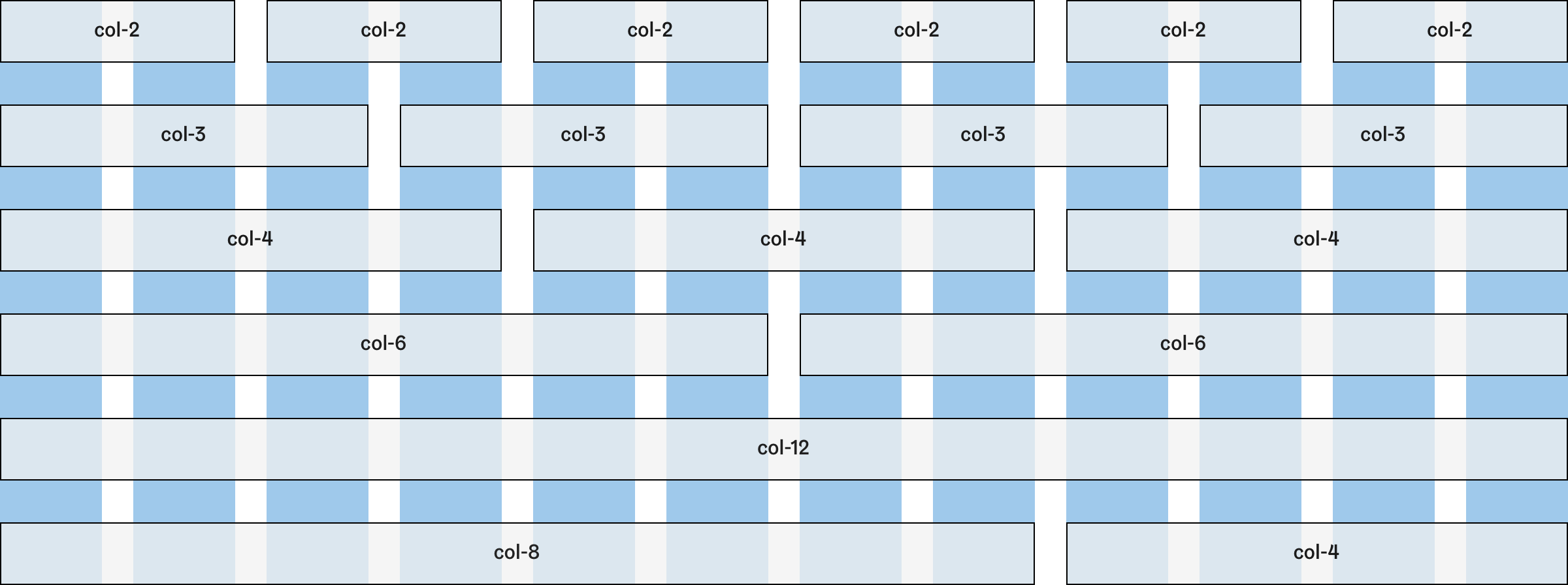
Helsinki Design System follows a 12 column grid system that scales across five defined breakpoints. Using a pre-defined grid system helps to keep visual consistency and rhythm across your designs and implementations.
HDS does not currently include an implementation of the grid. Grid is provided as specified breakpoints and other values which can be easily applied to most commonly used grid systems.
Principles
- HDS uses a standard 12 column grid whose maximum width is 1200 pixels. Container width and the number of columns change each breakpoint.
- Larger screen sizes use 24-pixel gutters while on mobile screen widths they shrink to 16 pixels and eventually to 12 pixels in the smallest breakpoint.
- Even though HDS does not include grid implementation, it recommends and suggests methods how to handle changing amount of columns and column stacking. See Layout columns for more information.
- HDS also offers a Container component that helps to follow breakpoints and container widths. For more info refer to Breakpoints documentation.
Grid behaviour
The following table presents how the HDS grid behaves and changes in different breakpoints. Maximum container width, the number of columns, and gutter size alter between breakpoints. Read more about breakpoint and container width tokens.
| Breakpoint token | Container-width token | Number of columns | Margin (gutter) in px |
|---|---|---|---|
--breakpoint-xs | --container-width-xs | 4 | 12px |
--breakpoint-s | --container-width-s | 4 | 16px |
--breakpoint-m | --container-width-m | 8 | 24px |
--breakpoint-l | --container-width-l | 12 | 24px |
--breakpoint-xl | --container-width-xl | 12 | 24px |
Layout columns
Dividing columns
12 column grid can be divided into multiple smaller columns. Prefer simple and even column combinations to maintain visual consistency across all screen sizes.
Column stacking
When the breakpoint is reached, columns will stack starting from the left. The developer or designer can also choose to alter column sizes if it helps to maintain a clearer and more consistent view.


