This section lists all components currently available in HDS.
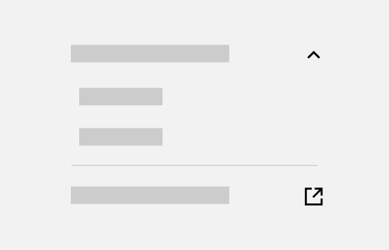
Accordion
Accordions can be used to hide and reveal information.
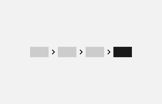
Breadcrumb
Breadcrumb provides links back to each previous page and shows the user's current location on a website.
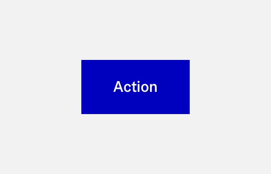
Button
Buttons are meant to make actions easily visible and understandable to the user.
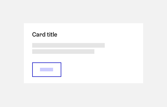
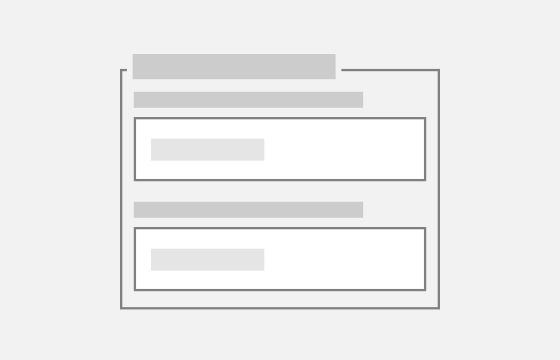
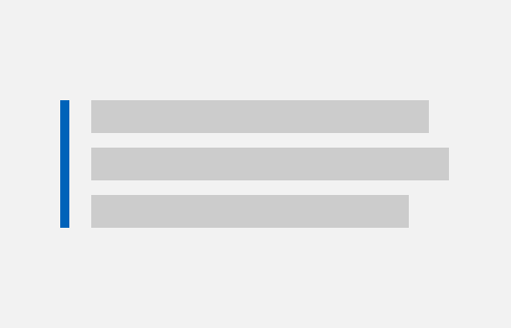
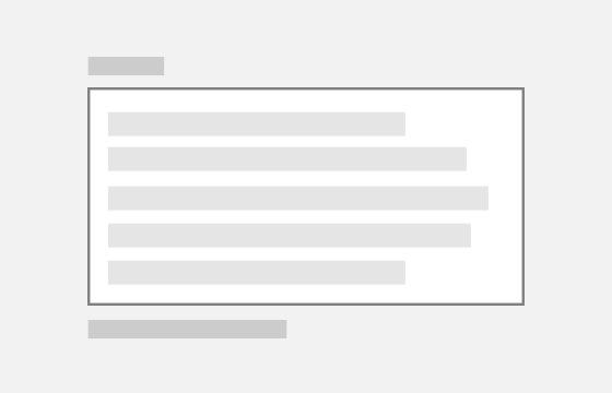
Card
Cards can be used to divide and organise interface content.
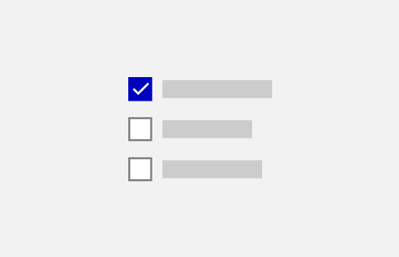
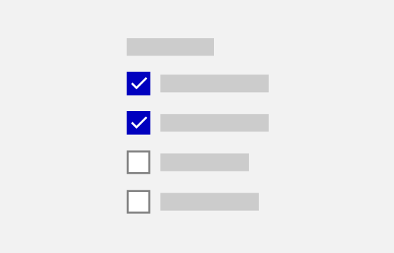
Checkbox
Checkboxes are used to select from one of more options.
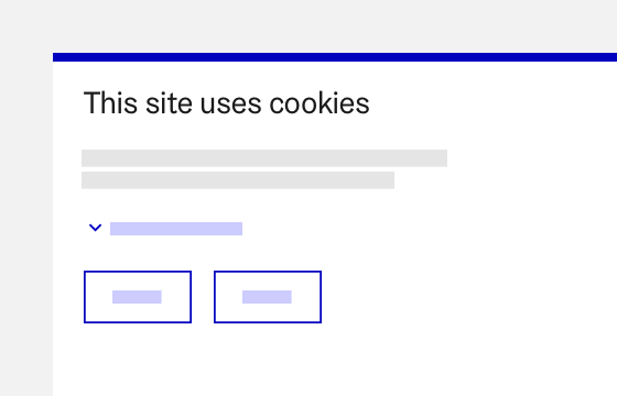
CookieConsent
The cookie compliance components informs users about cookie usage.
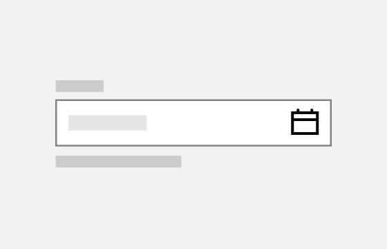
DateInput
Date input allows the user to easily input a specific date or a date range.
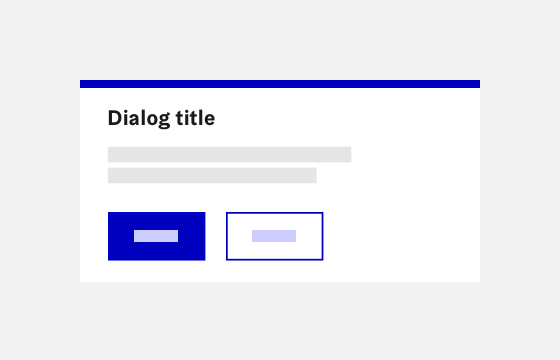
Dialog
Dialogs initiate a conversation between the service and the user.
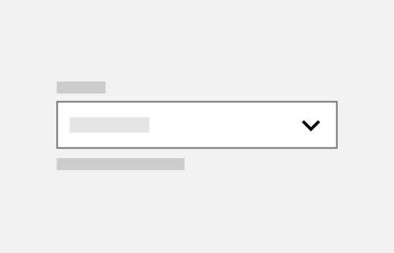
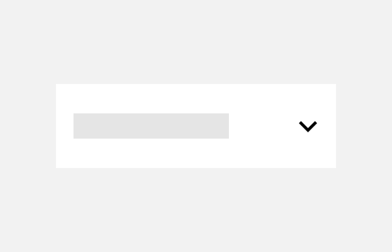
Dropdown
A dropdown offers a user a list of options, of which one or multiple can be selected.
Fieldset
Fieldset groups multiple related form input fields together.
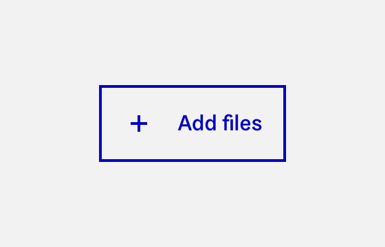
FileInput
A file input helps to browse and select files to be uploaded to the service.

Footer
The footer is located at the bottom of the page below the main body content.
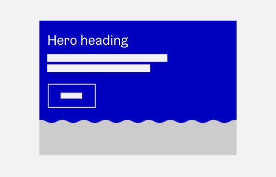
Hero
Hero is used below the main navigation as the first content element.
Highlight
Quote and highlight allow lifting an excerpt from a longer text to emphasize.
Icon
Icons are used for providing visual cues and highlighting actions.

Koros
Koros, also known as Wave motifs, are part of the visual identity of City of Helsinki.
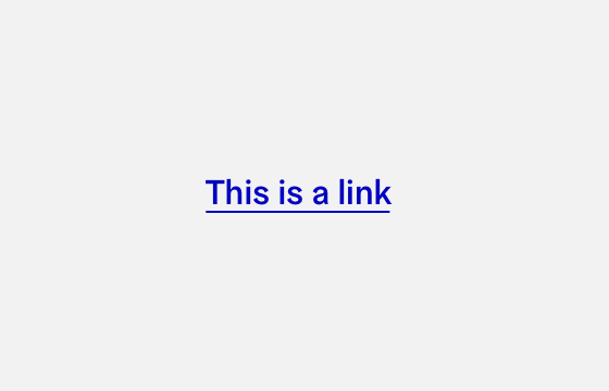
Link
Links are used as navigational elements and can be standalone or inline.
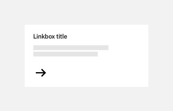
Linkbox
Linkboxes are used to combine elements into a single interactable element.
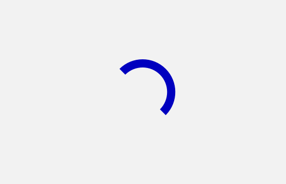
LoadingSpinner
Loading spinner is used for notifying users that their action is being processed.

Logo
The logo is used to identify the service as an official City of Helsinki service.
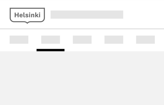
Navigation
A navigation component is the main way to navigate and locate in the service.
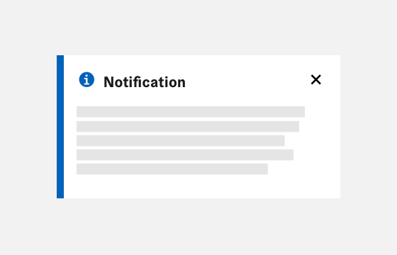
Notification
Notifications are used to present timely information to the user.
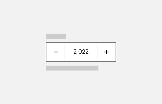
NumberInput
A number input allows the user to enter numeric values.
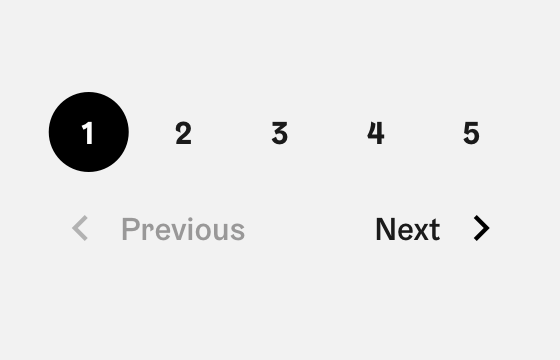
Pagination
The pagination component allows the user to navigate between pages.
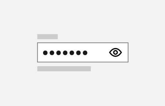
PasswordInput
A password field is an input field component that is used to input password data.
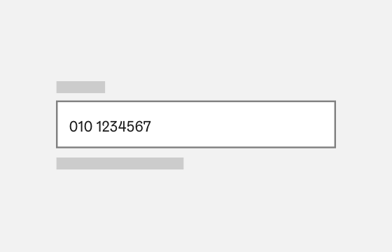
PhoneInput
A phone input allows the user to enter phone number values.
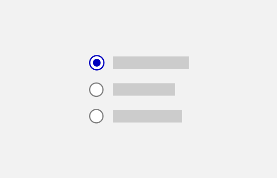
RadioButton
Radio buttons are used to pick an option when only one option can be chosen.
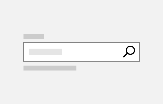
SearchInput
A search input allows the user to find relevant content.
SelectionGroup
Selection group allows grouping form selection elements to each other.
SideNavigation
A side navigation is an additional navigation located on the left of the viewport.
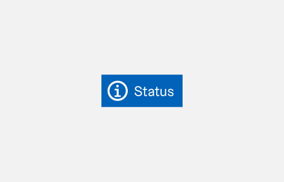
StatusLabel
Status labels can be used to highlight different statuses or items to the user.
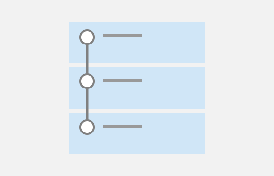
StepByStep
StepByStep component is useful for visualising a process in steps.
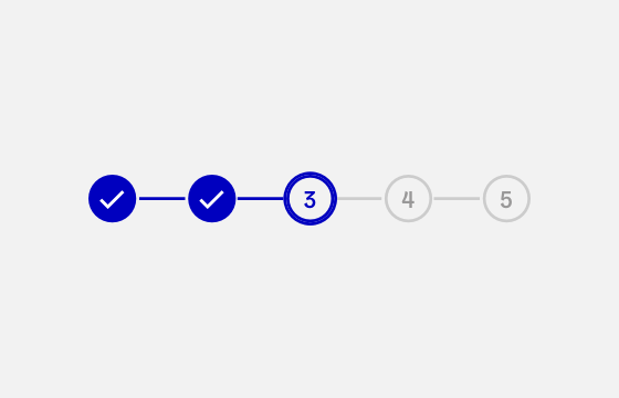
Stepper
The stepper helps to see the progression and to navigate between form steps.
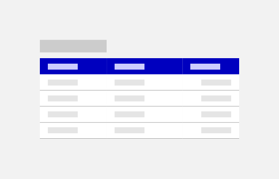
Table
Tables are used to present tabulated data to the user in a consistent manner.
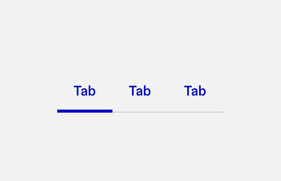
Tabs
Tabs are used to navigate between contents that have a relation.
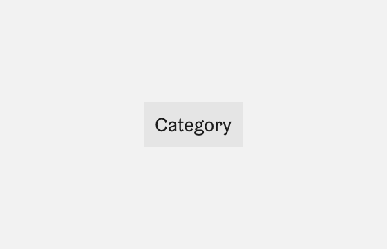
Tag
Tags are used to show attributes of an object or element such as categories.
TextArea
A text area is an input used for multiline answers.
TextInput
A text field is an input field that the user can use to input content and data.
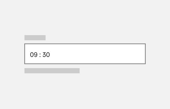
TimeInput
A time input helps the user select a specific time.
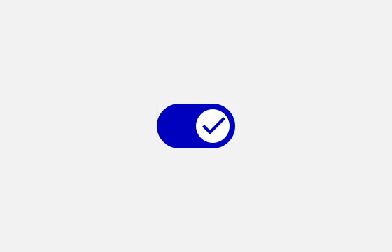
ToggleButton
Toggle button allows to switch between two states such as "On" and "Off".
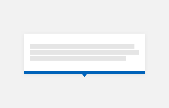
Tooltip
Tooltips are used to present context or background information to the user.
