Contributing to the design
Consistent design of components ensures a great user experience across services. You can contribute to HDS design libraries by proposing new components or additional features and fixes to existing ones.
HDS design versions are managed in City of Helsinki Abstract, in a project called Helsinki Design System.
The design assets are also available as a design kit package which is downloadable from the official HDS repository releases.
Proposing a design
There are two ways of proposing new designs to be added to HDS.
1. Opening a new branch to the Abstract repository
If you have access to the City of Helsinki organisation and Helsinki Design System project in Abstract follow these steps:
- Create a branch from the HDS Master branch. Branch name should follow naming convention Feature request: [Component name]. If a related Jira ticket exists, add the number of the ticket at the end of the branch name (for example
Feature request: dropdown-multiselect (HDS-123)). - Add designs related to your proposals to the component or category library file. If a suitable library for the component does not exist yet, add a new library file named
HDS [component name]See Guidelines for HDS design library files "Guidelines for HDS design library files") bellow for more detailed instructions. - When the design is done, make a commit along with a description of what changes were made, your component, how should your component be used, and where (give an example layout if possible).
- Submit branch for review and add HDS designers as reviewers. They will provide feedback and suggest changes if needed.
Do not merge your branch to Master without an approved review. HDS team will run the merge if the feature is accepted.
2. Creating an issue to the GitHub repository
If you do not have access to the City of Helsinki Abstract and HDS repository, you can create an issue in HDS GitHub repository.
- Use the component name as the issue name and label it as
feature-request. - When writing the issue, follow the "What & why" issue template. Be specific.
- You may attach a Sketch file containing the designs to the issue. You can also attach reference screenshots to illustrate your proposal better.
Guidelines for HDS design library files
When designing together, things tend to get messy. Here are some guidelines and tips that help us keep HDS library files clean, consistent, and easy to use for all.
Symbol naming and hierarchy
The symbol naming and folder structure of HDS Sketch libraries follow a hierarchy based on CTI (Category-Type-Item) naming practice. The CTI taxonomy is a guiding tool for deciding the hierarchy of symbols rather than a strict rule, and it can be adapted if needed.
The symbols and layer styles are sorted into folders by descending order of complexity in the following hierarchy:
Category / Type / Item / Sub item / Variants / State
- Category defines the primitive nature of a property (for example every property in the category
Colouris always a colour). - Type is a sub-category only applied to property tokens.
- Item is the actual React component or Token. A standalone entity that is meaningful on its own, for example a (
Button,Dropdown) or (Black,White). - Sub-item are standalone variants of items (for example Button component has sub-items
01 Primary,02 Secondary,03 Supplementary). - Variants are interchangeable symbol versions where some attribute of the item is changed (for example size, layout, colour tint, font weight, breakpoint size, functionality…). Variants can be for example
400 Regular,500 Medium… or .Left,Right- An item can have several levels of variants.
- Variant levels should preferably be sorted in descending order of scale:
- Theme (light/dark)
- Role (functionality, feature)
- Breakpoint (HDS breakpoints)
- Size (small, medium, large…)
- Shape (horizontal/vertical)
- Position/orientation (left/center/right, top/middle/bottom)
- Content (parts)
- Layout (alignment and position of content/parts)
- Appearance (fill, border, status, font weight…)
- State is a variant of a component caused by user interaction. For example Hover, Active, Disabled, Open, Closed etc.
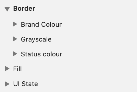
Example: Two levels of types in Colour category
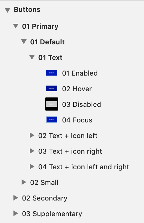
Example: The symbol folder structure in HDS Button, consists of:
- Item
Buttons- Sub-Items
01 Primary,02 Secondaryand03 Supplementary- Variants (1st level)
01 Defaultand02 Small- Variants (2nd level)
01 Text,01 Text + icon left…- States
01 Enabled,02 Hover…
Suffixes
- - modifier can be used to differentiate same level variants and states of items.
- Modifiers are separated from the variant name with a dash
-(for example01 Default - 1 row,01 Default - 2 rows...). - If a modifier adds something to the variant, a plus sign
+can be used instead (for example01 Selection,02 Selection + text…). - A modifier should be in all lower case.
- If the variant hierarchy is particularly complex, variation levels can be added as modifiers to help differentiate variations in the Sketch symbol menu (for example Body text variant
Body S - Regular - 01 Black - Center).
- Modifiers are separated from the variant name with a dash
- (Additional information) can be added at the end of the name within parentheses
(). For example the specific pixel size of a spacing token.
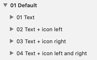
Example: + modifiers used for additional features
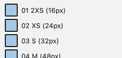
Example: additional info about spacing token pixel values
Internal symbol folders
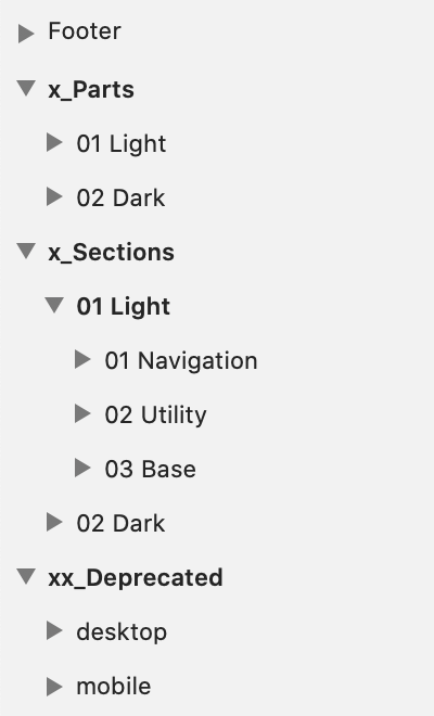
- x_Parts and x_Sections are helper symbols used only to enable customising component symbols in Sketch. They are not in themselves usable as components.
- Parts are elements needed for building overrides and larger nested symbols, but are not in standalone items.
- Sections are larger customisable blocks of complex components that need to be overridable in Sketch.
- Internal symbols are grouped in
x_Partsandx_Sectionsfolders, at the root level of the library. - The
x_prefix keeps folders at the bottom of the symbol menu.
- xx_Deprecated
- Old versions of items that are going to be replaced in the future but are still supported, are grouped into a folder
xx_Deprecatedon the root level of the library. - The
xx_prefix keeps folders at the bottom of the menu, even belowx_Partsandx_Sections.
- Old versions of items that are going to be replaced in the future but are still supported, are grouped into a folder
Example: x_Parts, x_Sections and xx_Deprecated folders on HDS Footer
Pages
- All symbols of one component are grouped on
[Component name]page.- Symbols are aligned and organised on the page in clear groupings.
- Examples of available variations of the component should be presented with
Exampleartboards.- Example artboard name should state the component or feature introduced (for example
Example - Responsive sizes). - Single component libraries and example artboards are grouped on the
Examplespage. - In libraries with more than one component, example artboards can be grouped in the
[Component name]page together with component symbols.
- Example artboard name should state the component or feature introduced (for example
- Additional instructions about the using of Sketch symbols can be documented on
Instructionsartboards (for exampleInstructions - Footer sections).- If the library has instructions, they can be grouped on the same page with examples named Examples & Instructions.
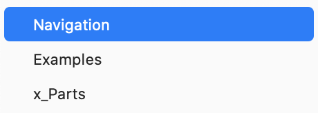
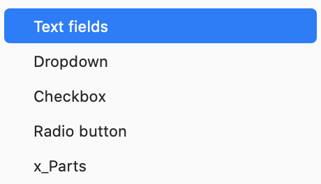
- Internal symbols are grouped on x_Parts and x_Sections pages.
- If the component has many different sections, each section can be grouped into its page (for example
x_Section - Navigation). - Deprecated symbols are grouped on the xx_Deprecated page.
Example: pages in a single component library HDS Navigation
Example: pages in a multi component library HDS Form fields
Library file name
- HDS [Library name] is usually the same as the Item name of the in singular form (for example
HDS Button). - If several items are grouped in one library, the Category of the items is used instead (for example
HDS Typography,HDS Form Components).
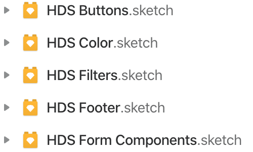
Example: HDS library file names
Symbol naming practices
- Naming language is British English (except for colour names that follow the brand guidelines).
- Naming should be consistent in design, implementation, and documentation.
- Taxonomic levels are separated with a forward slash
/to make a folder.- No spaces are used around the forward-slash
/. - Start folder names with a capital letter.
- No spaces are used around the forward-slash
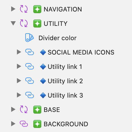
- Emoji prefixes and all caps can be used in layer names to make the hierarchy of complex override menus clearer:
- ❇️ [SECTION NAME] can be used to highlight sections (for example
❇️NAVIGATION). - 🔹**[Item]** can be used to highlight overridable items. The name can also be in all caps to make it more distinct (for example
🔹Base - link,🔹DIVIDER).
- ❇️ [SECTION NAME] can be used to highlight sections (for example
- Sketch smart layout hacks may demand extraneous groups to work. In these situations, mark
(smart layout)in the name of the group.
Example: Emoji prefixes in HDS Footer layer names
Naming variant types
- The basic form of the component can be named
01 Basic - Recommended variant can be named
01 Default - Size variants are named with T-shirt sizes
S,M,L,XL,2XL…). - Colour theme variants are named
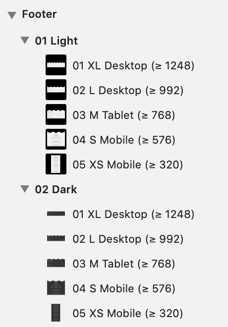
01 lightand02 Darkaccording to their background colour. - Breakpoints are always named in the same way:
01 XL Desktop (≥ 1248)02 L Desktop (≥ 992)03 M Tablet (≥ 768)04 S Mobile (≥ 576)05 XS Mobile (≥ 320)
Example: Colour theme and breakpoint variants in HDS Footer
Sorting variants
Numbering can be used in front of the name for listing symbols in a specific order.
- Running numbering with a leading zero is used for general sorting (for example
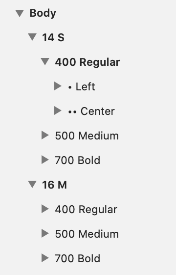
01 Primary,02 Secondary,03 Supplementary). - Semantic numbering can be used to help communicate variants (for example naming font weights by CSS values:
400 Regular,500 Medium,700 Bold. - A good practice is to order variants from simple to complex (for example
01 Text,02 Text + heading…).
Example: Sorting variants in HDS Typography uses custom prefix for alignment
Quality assurance checklist
With the following checklist, you can check your design files before merging them into the HDS master.
Besides checking HDS library files, this list can also be applied to any Sketch project for better organisation.
This checklist is (in most parts) also available as a Sketch Assistant that automatically runs a preflight check for Sketch files. If you have Sketch installed on your computer, you may click the following link to automatically install the assistant.
For more information see the HDS Assistant Github page. If you have Sketch installed on your computer you can use the following link to automatically install the assistant (the link will not work if you do not have Sketch installed on a Mac computer).
Add HDS Assistant to your Sketch (requires Sketch and a Mac computer)Styles
Use shared text and layer styles in components
- Text layers are styled with
HDS Typographytext styles. - Layer fills and borders are styled with
HDS Colourshared styles. - Don’t use local styles. All styles used in HDS components should be found in HDS libraries.
- Respect the shared styles. Don’t customise or break the linking to the original style. This can cause trouble if shared styles are updated later on.
- If the style you need is missing from shared styles propose adding a shared style to the HDS style libraries.
Layout
- Align elements and artboards to pixel grid
- Use HDS Spacing values for margins and paddings
- Use
Spacingtokens for the component's internal spacing. - Use
Layouttokens for margins between elements in the layout.
- Use
Layers and groups
- Order layers in a hierarchy that are easy to understand from the symbol menu overrides.
- Layer order = order of overrides in the symbol menu.
- Layer order and hierarchy should follow the layout order.
- Give layers and groups names that state their purpose or content
- Avoid automatically generated names like
Copy,Group…
- Avoid automatically generated names like
- Group layers that belong together
- Delete hidden layers or groups
- Delete loose layers or groups that are outside artboards
- Delete empty groups
- Ungroup unnecessary groups
- Groups should have at least two items in them.
- Avoid groups that have only one another group in them.
- Note! Sketch smart layout hacks may demand extraneous groups to work. In these situations, mark
(smart layout)in the name of the group.
Symbols and overrides
- Follow the HDS guidelines for symbol names and folder hierarchy
- Variant names are easy to understand from the symbol menu and overrides.
- Interchangeable variants are grouped so that are easy to swap from the symbol menu and override.
- Avoid designing custom parts for components
- Always check if there’s an existing HDS component to answer your need, before making a custom part.
- If custom parts are needed for example to make customisable nested symbols, group them in the x_Parts folder. See naming conventions for more detail.
- Overridable text fields default value states the fields purpose
- Hide unnecessary overrides
- Check that the symbol Smart layout works, and allows all the customisation needed
- Margins and paddings are fixed.
- Height and width of elements that should not scale are fixed. For example Icons.
- Text fields scale inappropriate directions when the symbol is scaled.
- Text fields scale inappropriate directions when content is customised.
