Building forms
Forms are groups of controls that allow the user to input, modify and select data values or configure options.
Principles
Forms should be designed to be as clear and straightforward as possible, to allow the user to complete the task quickly.
- Only ask for absolutely necessary information
- Respect the user’s privacy and GDPR regulations
- Be sensitive for example about asking the user’s age or gender
- Make sure you the service is allowed to collect and hold the data, for example about an underaged user.
Follow a logical, predictable order (for example first name, last name).
Group related tasks under section titles to provide more context and make the interface easier to scan.
Provide clear, descriptive headlines, fieldset legends and labels to help the user easily scan and get the gist of the form.
Divide long forms into smaller steps to make it easier to understand and validate.
Enable autocompleting values to provide automated assistance in filling out form field values.
- Provide an appropriate autocomplete attribute to fields.
Pre-populate known values if possible to make filling the form easier.
The user should not be made to input the same information twice.
Pre-populate known values if possible to make filling the form easier.
The user should not be made to input the same information twice.
- Use gender-neutral language.
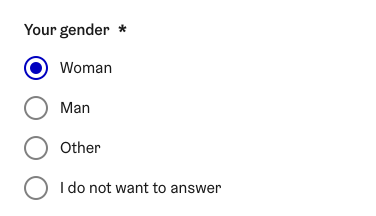
When asking for gender, refer to the example in the gender-neutrality chapter .
The user should not be made to constantly switch between keyboard and mouse while filling the form.
Accessibility
A change in a form controls value or state must never trigger a change in page context.
Form controls must only be used to change page content.
To trigger any change in context, an button must be used.
A change in from control happens for example when:
the control receives focus (
WCAG 2.1 success criteria 3.2.1 On focus
)
the value is changed (
WCAG 2.1 success criteria 3.2.2 On input
)
A change in content is for example:
- Visual changes, such as an expanding an outline
- Opening a dynamic menu or dropdown
Adding/removing or showing/hiding form controls based on previous selections (for example showing a set of additional questions related to a previous selection)
A change in context is for example:
A major change in content or layout that alters the meaning of the page, or makes it look like a different page (for example significantly re-arranging the content of a page).
- Moving focus to a different component
- Opening a new browser window or tab
Choosing the right component
Different form controls have all different functionalities and specific use cases. Here are some guidelines on when each form control should be used.
Entering text
Text inputs
Enable the user to input a freeform string of text that does not have a specific format.
| Control | Name | Usage | Examples | | -------------------------------------------------------------------------------------------------------------------------------- | ---------- | ------------------------------------------------------------------------- | -------------------------------------------------- | --- | |
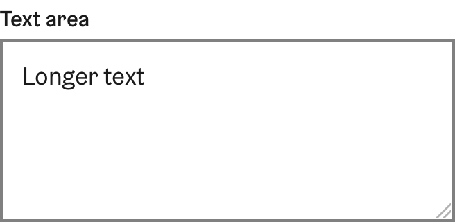
| Text input | Entering short strings of texts or numbers no more than a few words long. | | | | Text area | Entering multiple lines of text. | Messages, descriptions, feedback, support requests | | | [Table 1:Text inputs available in the HDS] |Data inputs for specific types and formats
Enable user to input textual data of a specific type. While this kind of data could be inputted to a text input, it is always recommended to use a data-specific input if it is available.
| Control | Name | Usage | Examples | | ----------------------------------------------------------------------------------------------------------------------------------------------- | ------------------ | -------------------------------------------- | ----------------------------------------------- | --- | |
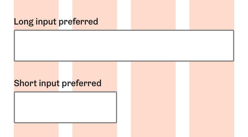
| Number input | Entering a number. | Prices, amounts, numbers with units | | | | Date input | Entering a date. | Event dates, birthdays, dates as filters | | | | Time input | Entering a time in a clock format. | Event start time, parking end time | | | | Phone number input | Entering a phone number. | Phone numbers in different locale formats | | | | Password input | Entering a password or other sensitive data. | Passwords, passphrases, sensitive personal data | | | [Table 2:Data inputs available in the HDS] |Adjust the width to reflect the intended length of the content.
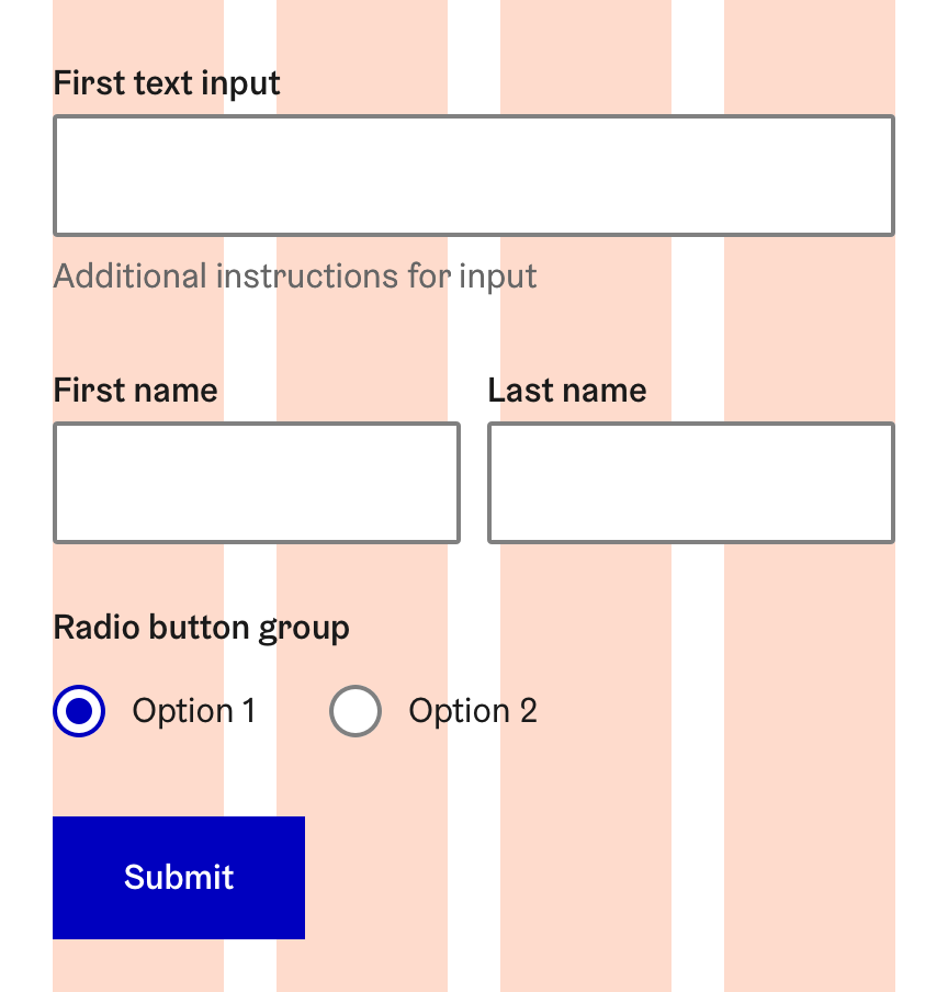
Align the width to the responsive column grid.
- If an input is too long to be fully displayed in the field, truncate the value with ellipsis.
Always use a dedicated input type if it is available. E.g. use the phone number input for inputting phone numbers.
- Make sure users can enter their information even on smaller screen sizes and mobile devices.
Selecting from pre-defined options
Enable the user to enter an input by selecting from a set of pre-defined options.
Each selection control has a specific use case. To learn which one to use, see HDS Guideline Checkboxes, radio buttons, or toggles documentation page.
| Control | Name | Usage | Examples |
|---|---|---|---|
| Checkbox | Selecting a single option. | Agreeing to terms and conditions | |
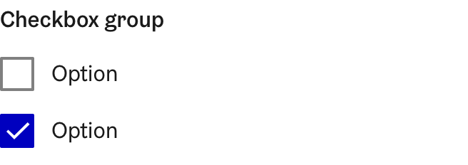
| Checkbox group | Selecting one or more options from a short list. |
| |
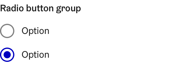
| Radio button group | Selecting a single option from mutually exclusive choices. | Picking a type | |
| Toggle button | Choosing between binary options. | Changing a setting, switching a theme |
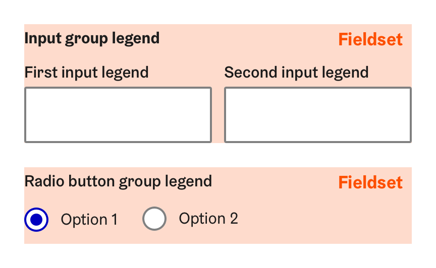
Related checkboxes and radio buttons must be grouped to a fieldset with a legend stating the selection being made made.
Long list of choices
| Control | Name | Usage | Examples |
|---|---|---|---|
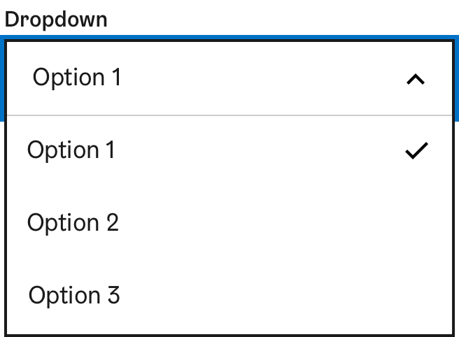
| Dropdown select |
| ||
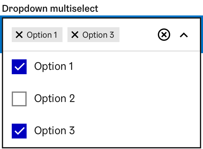
| Dropdown multi-select |
| ||
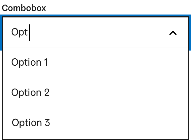
| Combobox select |
| Choosing for example city of residence, place of birth, or language preference | |
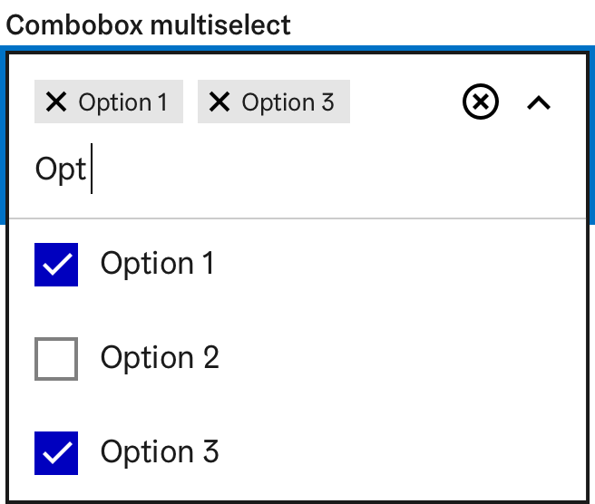
| Combobox multi-select |
|
Dropdown or combobox must never be used for listing links. Links cause a change in context (see form accessibility principles)
Performing actions
To enable the user to perform actions effecting the whole form or a group of form components, buttons should be used.
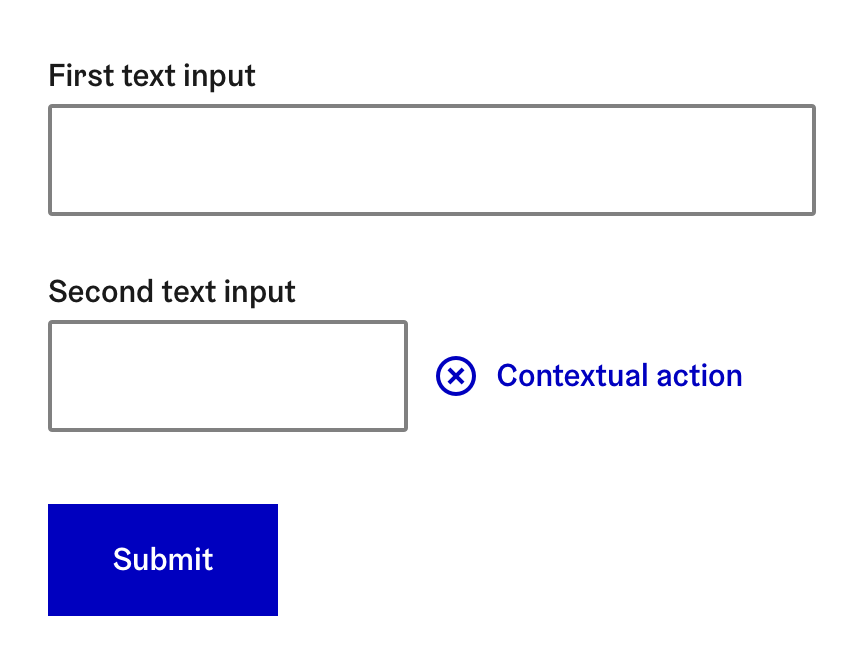
Individual form controls can also have action buttons attached to them, that let the user execute commands or other actions within the form element.
| Control | Name | Usage | Examples |
|---|---|---|---|
| Primary action | Submitting inputted data to the defined form handler on the server. | Submit | |
| Secondary action | Allowing user to perform important and form-wide actions before submitting:
|
| |
| Supplementary action | Allows user to perform:
|
|
All static forms must have a submit button.
When form controls are used to dynamically change content (for example filtering a dataset), submit button is not necessary.
The submit button must be the only primary action in a form.
The submit button should be the last element of the form
All required fields and important information considering the form must be placed before the submit button.
For example: user is required to approve terms or conditions, or read “small print” before submitting the form.
Keep it simple. Don't confuse the user by overcomplicating the form.
The number of secondary and supplementary actions in a form should be kept as few as possible.
Actions should be grouped together, to help the user understand all the actions available in the form at a glance.
- Icons can be used to differentiate multiple actions.
Prevent accidental loss of data when performing destructive actions. For example clearing all form fields.
The user should be asked to confirm the action (for example with a modal).
In multi-page forms the action should only be performed to the current page.
After clearing all form fields, the focus should be moved to the beginning of the form.
When performing non destructive actions, the user can be informed about the change made, for example with a toast notification.
Supplementary actions should always have both text label and icon, to differentiate them from text links.
- The Small button variant can be used for inline actions.
The submit button must not be placed outside the form element. For example inside the footer.
Actions performed inside a form must not affect elements outside the form without confirming the action with submit.
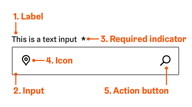
Basic elements of a form control
There are several different types of form controls, but they share similar basic elements and functionalities:
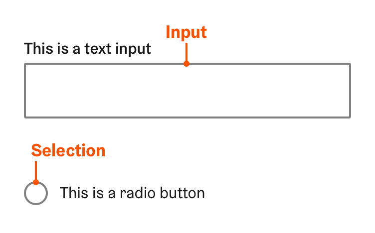
- Input or selection
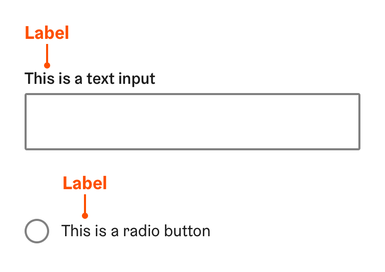
- Label
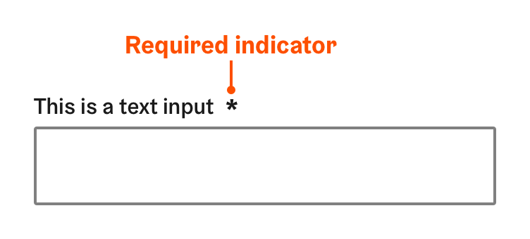
- Required field indicator
- Icon
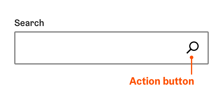
- Action button
1. Input field or selection
The actual interactive control element that allows the user to input or information or select an option.
Adjust the size of the input field or selection to indicate the length of the preferred input or average option.
2. Label
The name of the form control that clearly states the purpose of the control or what information the user is required to input
All form components must have a text label.
- The label can also be substituted with an action button added to the form control.
If an action button is used to substitute a label, it must have a text label, not just an icon.
- An exception is made in the HDS navigation search component which follows a widely used pattern.
The label must be always visible to the user.
Be descriptive.
The user must be able to understand the purpose of the form control from the label only.
Keep it short.
- Preferably use less than five words.
If the user needs more information for filling the information, it should be provided with assistive text or tooltip.
- Use ALL CAPS.
- Use a colon : after label names.
3. Required field indicator
Marking that indicates a form control for which the user must enter a value in order to successfully submit the form.
aria-required="true" attribute must be always provided for required fields
, even if they are not marked visually.
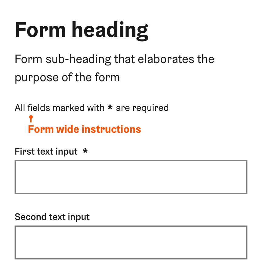
If your form has at least one required field, explain the asterisk before the form. E.g. "All fields marked with * are required".
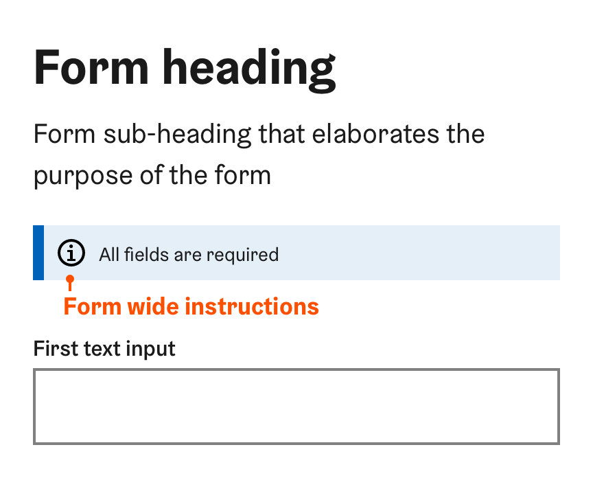
If all fields in the form are required
This should be stated in the form-wide instructions at the beginning of the form.
- The submit button can also be disabled before all fields are filled.
4. Icon
Icon is a supplementary visual representation of the label displayed inside the form field.
Icons can be used to:
- Emphasise important form controls visually.
- Differentiate similar form controls easier from each other.
Be descriptive.
- Choose an icon that clearly describes the type fo input or purpose of the form control.
- Do not use arbitrary or vague icons just for visual purposes.
See HDS icon guidelines for more information about using and choosing icons.
An icon must not be used to perform an action. Use an action button instead.
5. Action button
Some HDS form controls have actionable elements for executing commands or other actions within the form element. They provide an additional functionality to the form control for example to:
- Execute a search with inputted value.
- Clearing all selections in multi-select dropdowns.
Although the action button is visually similar to an icon, the implementation is different.
In HDS form components, action buttons are used for predefined purposes and should not be customised.
Interacting with controls
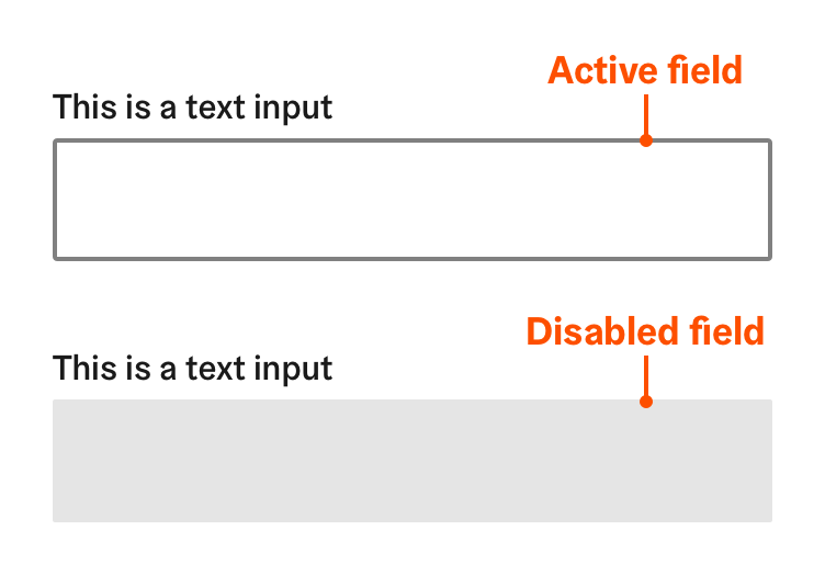
Active and disabled
Form controls are either active or disabled depending on for example selections made in previous controls in the form, or user permissions.
- Active form controls can be focused and given a value. Form components are active by default
- Disabled form controls cannot be clicked or focused with keyboard.
- The disabled attribute is be set for a form control to keep a user from using it until some other condition has been met (for example a text input can be disabled before a checkbox is selected).
Disabled form controls can also be hidden from view but in most situations all fields – even the disabled ones – should be shown to the user.
- Showing all fields makes easier or the user to understand all the possible actions in the form.
- Previously hidden fields suddenly appearing into a form can confuse the user.
As a rule of thumb, a disabled field should only be hidden, if the user
- is not provided with a way to activate the field,
- does not have the permission to change the fields value
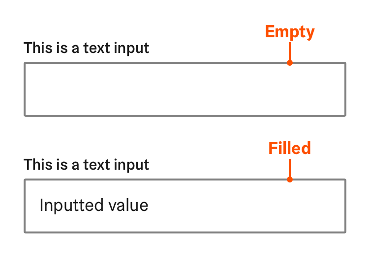
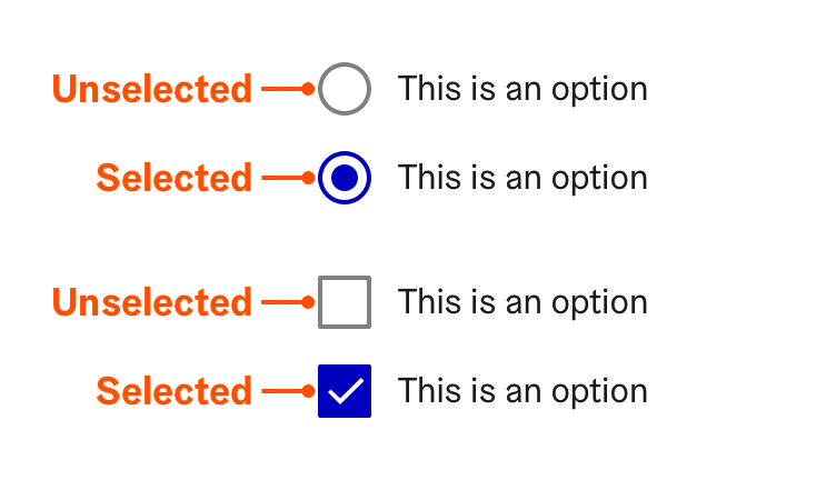
Empty/unselected and filled/selected
Allowing the user enter a value either by input or selection is the form controls main purpose. Make it as easy and straightforward as possible for the user.
Help the user by minimising unnecessary and redundant work needed for filling the form. Especially long forms can become tedious to fill, especially, if the same information must be entered multiple times.
Provide a pre-selected default option if some option is known to be the most commonly used.
- Pre-populate known values if data is available.
The user should not be made to input the same information twice.
Enable autocompleting input to assist users filling forms by pre-filling field values based on earlier user input (for example the user’s address).
The appropriate input purpose should be defined with autocomplete attribute where applicable.
The autocomplete attribute hints the browser that the field can be autocompleted, and the type of information required.
See more about
input purpose terms used for autocomplete
.
Selections that demand the users consent, like approving terms and conditions must never be pre-selected
as default.
Providing instructions
To help the user enter the right information in the right format, guidance can be provided on different levels:
- Form main and sub-heading summarise the purpose of the form
- Form-wide instructions to help the user to better understand the functionality of the form
- Contextual instructions for helping the user to fill specific form controls
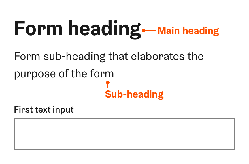
1. Form heading and sub-heading
The form heading summarises the purpose of the form and indicates the user where the form begins.
- The main heading should clearly and concisely describe the purpose of the form.
- Full page forms should always have a main heading.
- From smaller inline forms embedded to page content, the heading can be omitted.
- If the purpose of the form cannot be sufficiently summarised by the main heading, it can elaborated with a sub-heading.
If the form has a main heading, it must be the first element
The main heading should preferably be h1 element, even if visually styled as a smaller level heading.
The the sub-heading should placed right after the main heading, and preferably be a h2 element.
- Keep it short and descriptive!
Main heading should be less than five words.
Sub-heading should be less than two to three sentences.
2. Form-wide instructions
To help the user better understand the functionality of the form, instructions and other information about filling the form and required information should be provided in the beginning of the form.
The instructions should be placed after the heading and sub-heading, before the first form control or fieldeset.
The inline notification component can be used for form-wide instructions if they contain something out of the ordinary.
If your form has at least one required field, explain the asterisk before the form. E.g. "All fields marked with * are required".
3. Contextual instructions
Instructions related to specific form component can be provided for the user in three different ways. They each have different uses and levels of importance:
- Assistive text provides essential information
- Tooltip provides context or background information
- Placeholder acts as a supplementary visual aid
a) Assistive text
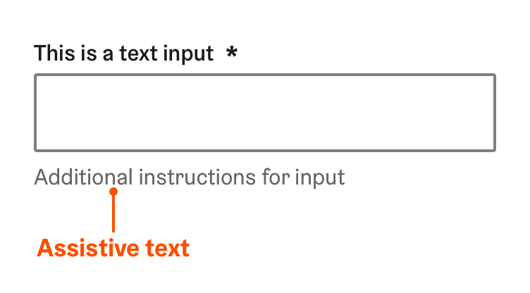
A short secondary description that elaborates the label and helps the user to provide the right information in the right format.
The assistive text is always visible to the user, so any essential information the user needs to complete their task must be provided as assistive text.
- Displayed below the form control
- Screen readers read the assistive text after the label when focusing the form element.
- Keep it short and clear.
The user should be able to provide the right input based on the label and assistive text alone.
Assistive text should not be longer than the form control and more than two rows.
The assistive text should only be used for essential information. Avoid causing unnecessary cognitive overload for the user by giving too much information.
b) Tooltip
A popup element that provides context or background information that is “nice to have” but not essential.
- Should be used to:
- Explain to users that may be unfamiliar with a particular form control.
- Offer a rationale for why certain information is needed.
- An action button is added on the right side of the label.
- The tooltip opens, when user clicks the action button.
- Be clear and concise.
Although tooltips can provide more information than the assistive text, they should preferably be less than two or three sentences long.
Provide a link to a separate page, if more detailed information is available.
Always open links from tooltips to a new window, so that the process of filling the form is not interrupted.
- Make the tooltip open on hover.
- The user should be able to select the text inside the tooltip element.
Tooltip must not be the sole way to provide essential information that the user must know to fill a value.
c) Placeholder text
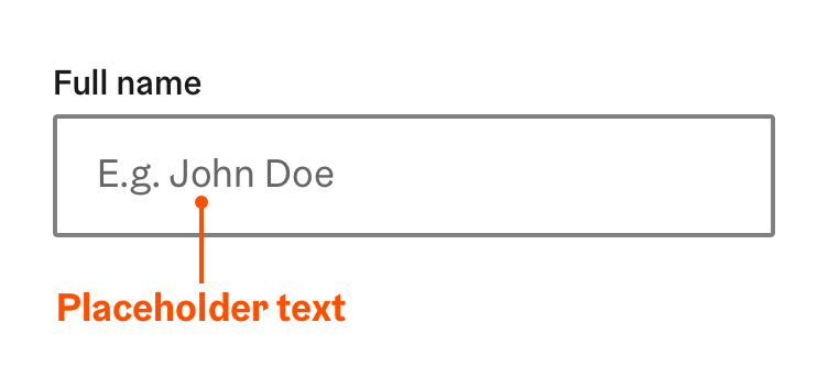
Placeholder text is a supplementary visual aid displayed inside the form control that can be used form making the form easier to fill.
It can be used to provide the user a hint of what to enter or what is selected with the form control:
- The preferred format of the input (for example Social security number: "E.g. 000000-123A”)
- An example value or option (for example City: “E.g. Helsinki”).
Write placeholder text in a way that it can immediately be recognised as not being an actual value.
Format examples should be generic rather than real values. If the placeholder seems like an actual value, the user can mistake the field to be already filled.
Values examples should preferably start in a way that clearly indicates it is a placeholder. For example: Full name: “E.g. John Doe”, (in Finnish Koko nimi: “Esim. Matti Meikäläinen”)
Leave the placeholder empty if an example value that would be generic enough to be recognised as placeholder can’t be found.
Screen readers do not differentiate if the element is a placeholder or an actual value. Even though assistive technology users are usually accustomed to this, it can possibly cause confusion.
- Never use the placeholder as the only channel to provide crucial information.
Corresponding information must also be provided within the label or assistive text
- Placeholder disappears once the user begins to input data
The way screen readers treat placeholders varies. Some read it only when no value has been inputted, some read it even when a value has been inputted.
- An exception is made in the HDS navigation search component which follows a widely used pattern.
Providing structure and hierarchy
Forms can be made easier to understand for the user by providing visual and semantic structure in different ways.
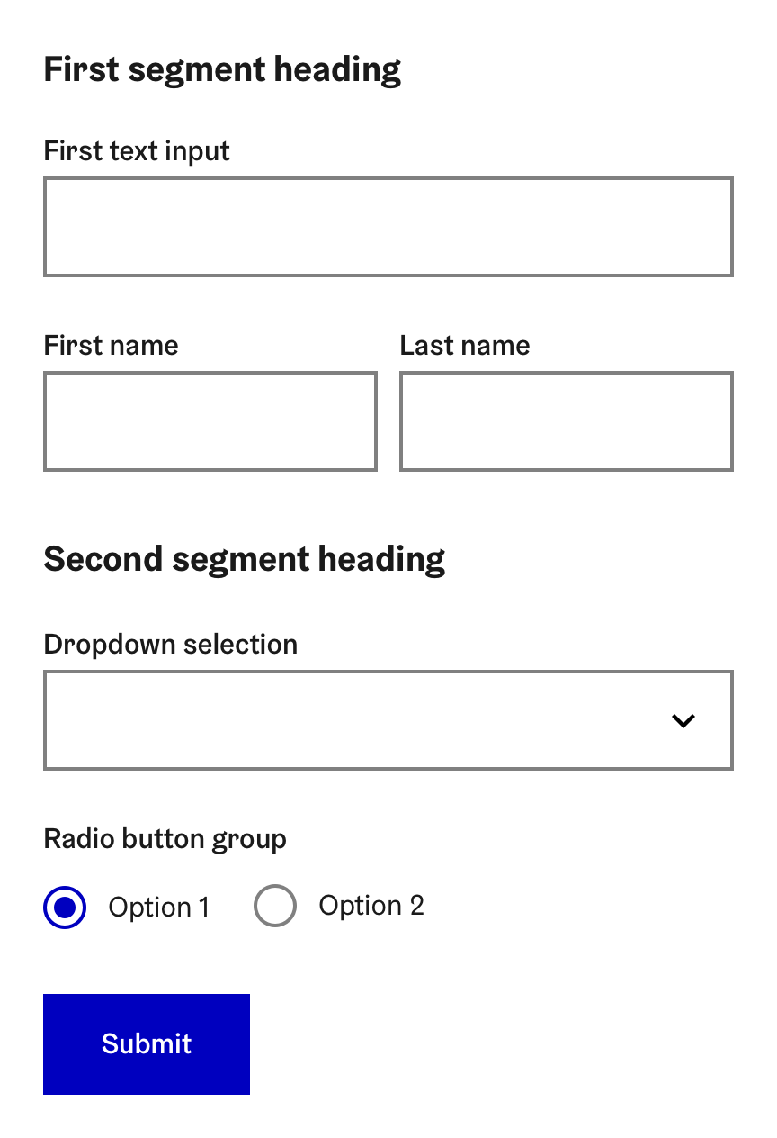
- Consistent layout communicates the structure of the form clearly.
- Grouping related tasks helps the user to understand what form controls belong together.
- Segmenting with section headings helps the user to understand how form fields relate to each other and the whole.
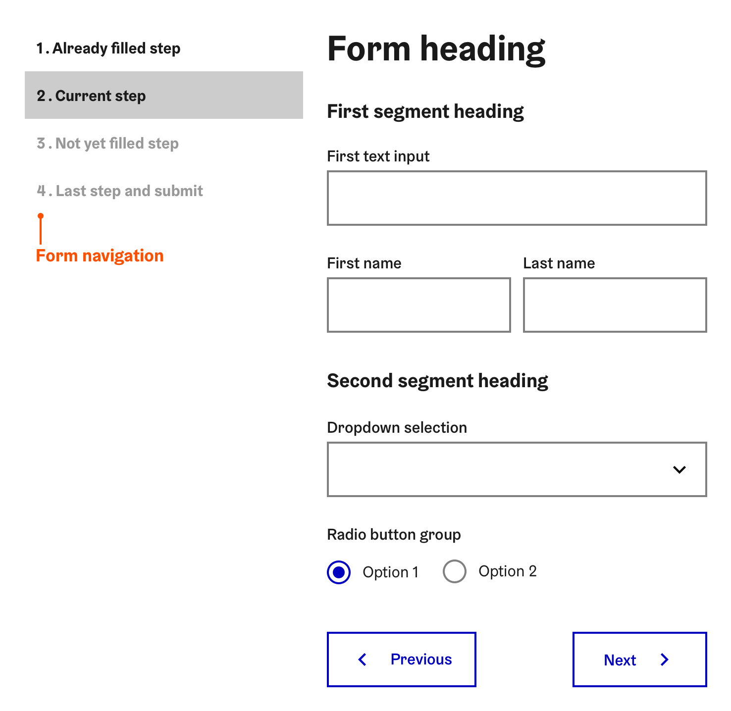
- Dividing long forms into separate steps reduces cognitive load with progressive disclosure.
1. Consistent layout
Best practices for form layout.
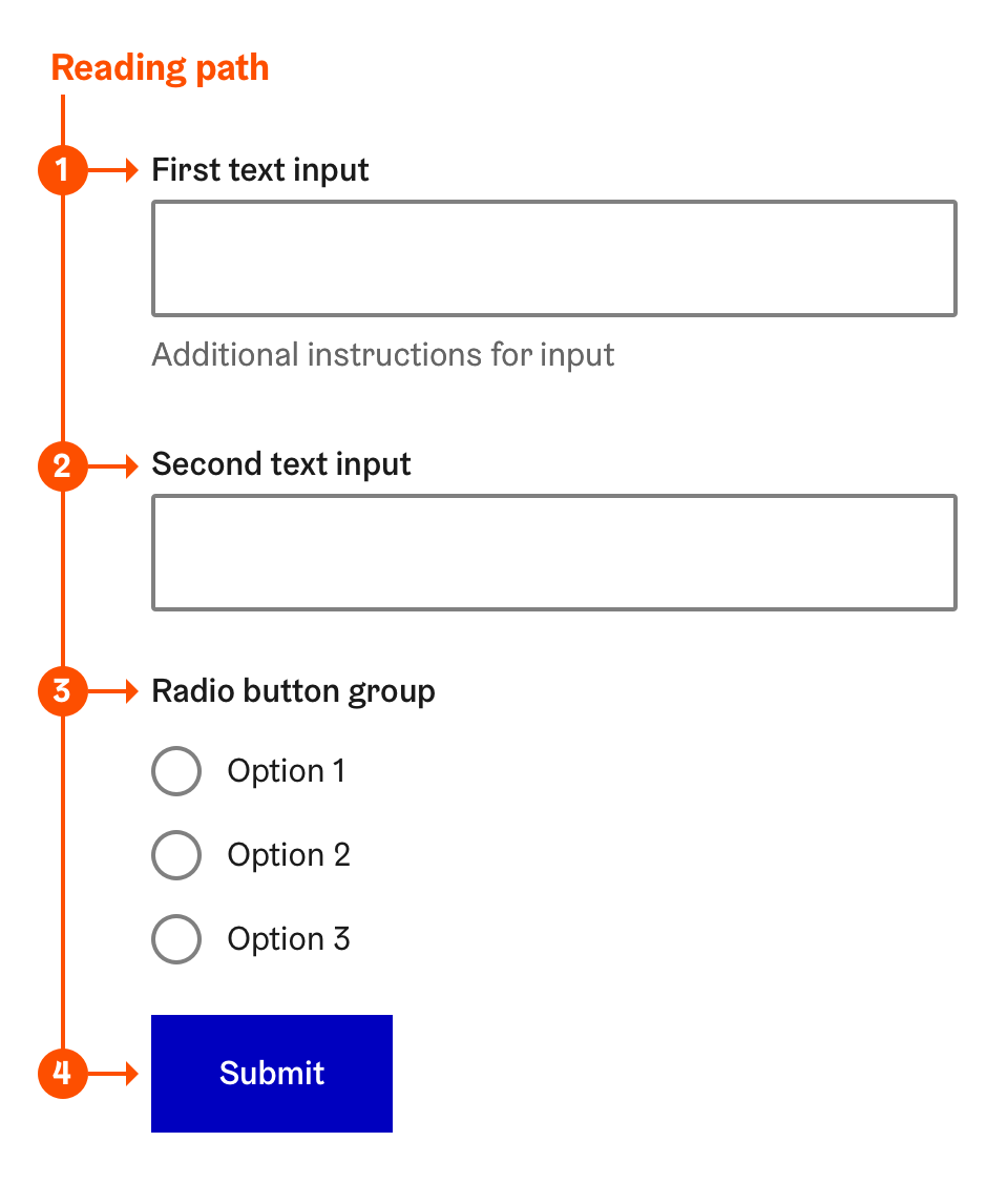
Prefer single column vertical layout over multi-column layout.
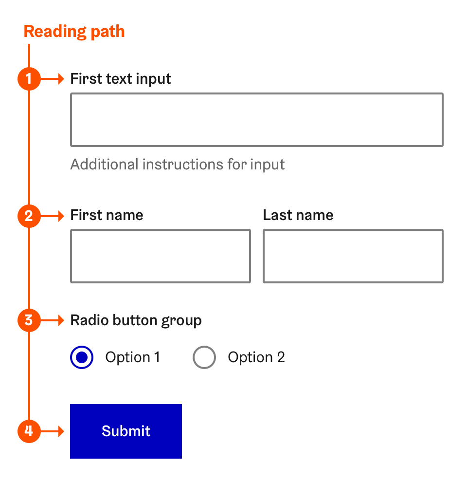
Stacking form controls vertically to form a "F-shaped" reading path through the form takes more space but makes the users path from control to control smoother.
If the user has to jump between more than one columns, the structure of the form, and reading path can become hard to follow.
Fields combining several inputs together with a fieldset, can be placed next to each other.
For example:
- Two to three radio buttons with short labels
- First name / last name
- Date (day/month/year)
- Time (hour/minute/second)
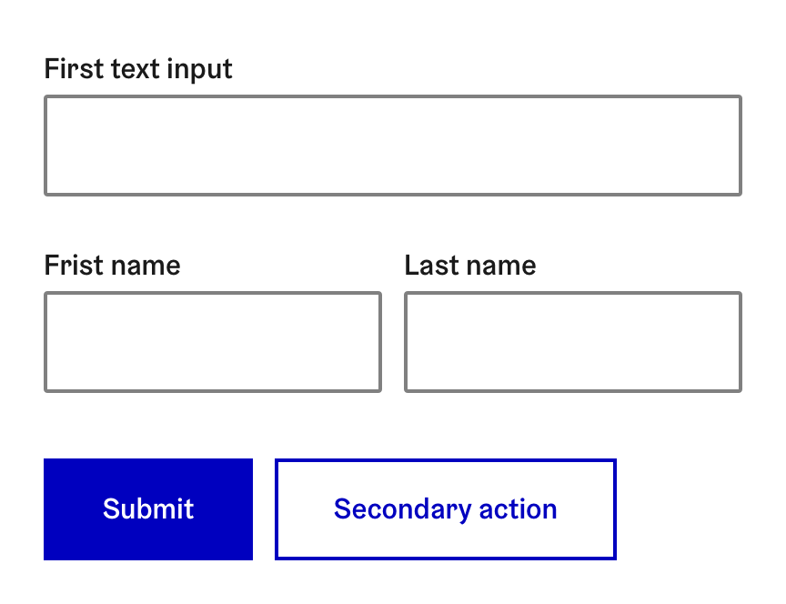
Group form-wide action buttons together. Best practice is to place action buttons at the end of the form, aligned to left and ordered by importance.
- Submit (primary action)
- Secondary actions
Align supplementary action buttons related to singe form control or fieldset after or bellow the control
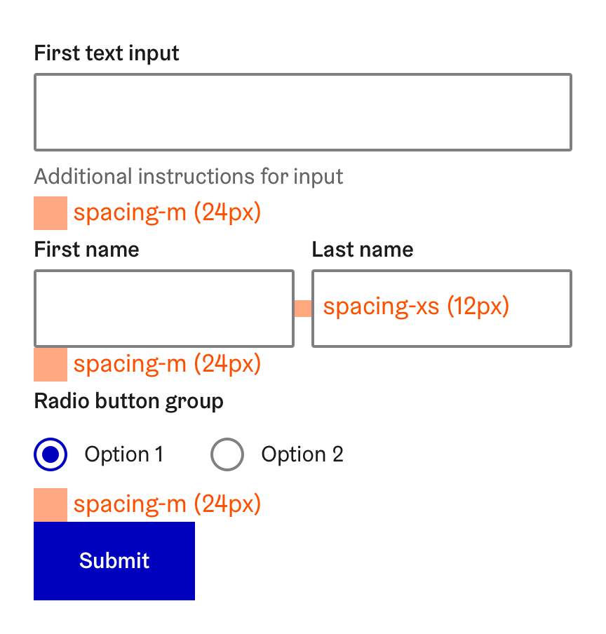
Use spacing tokens for grouping form controls with proximity and
separation
- Use smaller spacing between controls that belong together and larger spacing between groups of controls
Align form controls to column grid.
2. Grouping related controls
Form controls that perform a common task or share a common purpose should be grouped together within a 'fieldset' element and labelled with a 'legend' element, which describes the purpose of the form control group.
Fieldsets make it easier for users to comprehend forms and setup dialogs more quickly, and help screenreader users to understand where form groups begin and end, and the purpose and number of elements in a related group. Many assistive technologies will also use the legend element as if it is a part of the label of each control inside the corresponding fieldset element.
The fieldset element is used for grouping:
- Set of form controls that together perform a task yielding a single value.
- The fieldset legend describes the selection made while the radio button or checkbox labels describe the options available.
- Assistive technologies will also announce the number of selections inside the group when the fieldset receives focus.
- Set of form controls that are closely related but yield separate values.
- For example text inputs like “Name” (first + last), “Birthday” (day + month + year), “Address” (street address + zip + city)
3. Segmenting with section headings
To make the structure of the form even more understandable, form controls that share a common theme should be grouped into sub-sections with a heading. Especially long forms benefit from segmenting the flow into smaller segments.
- Use the proper heading level: If the form heading is h1, the segment headings must be h2.
The segment heading should describe how the form controls are related to each other and to the form as a whole
- For example “Personal information” or “Payment information”.
4. Dividing long forms into separate steps
Filling a long form can be daunting task for the user. One way to make a long form seem less like a chore is by progressive disclosure – dividing the form into separate steps that are shown one page at a time.
This approach also makes fixing validation errors easier, when the inputted data can be validated and fixed step by step, and thus fever errors are shown at a same time.
Coming soon
A set of radio buttons or checkboxes must be grouped together with a fieldset.
- Divide the form in approximately even sized steps
- Show one theme per page. For example Contact information – payment information – selected options etc.
- Give each step a short, descriptive heading with a h1 element.
- List all the steps needed to complete the form in a separate form navigation
- Show the heading of each step in the navigation
- Show the form navigation through the filling process.
- Show the user their progress page by page as they fill the form
- Let the user navigate back to previous steps
- Disable next steps before all previous steps have been filled (and validated)
- Validate the data after each step and let the user fix errors before proceeding to the next step
The user should only be allowed to proceed to next steps by clicking the "Next step" action button, to ensure the data is validated.
If the user navigates back to a previously filled step and changes any input value, the following steps should be disabled in the form navigation.
Keyboard navigation
Navigating between form components with keyboard not only helps users with using assistive technologies but makes filling forms easier for all users. Switching between mouse for navigation and keyboards for inputting values can become tedious, especially if the forms has lots of text input fields.
For this reason it is essential to ensure that individual controls receive focus in a logical order:
- When user first enters a form give focus to the firs element by default, so users can tab through all the form elements.
- Proceed focusing individual controls from left to right – top to bottom.
An example focus order for a single page form:
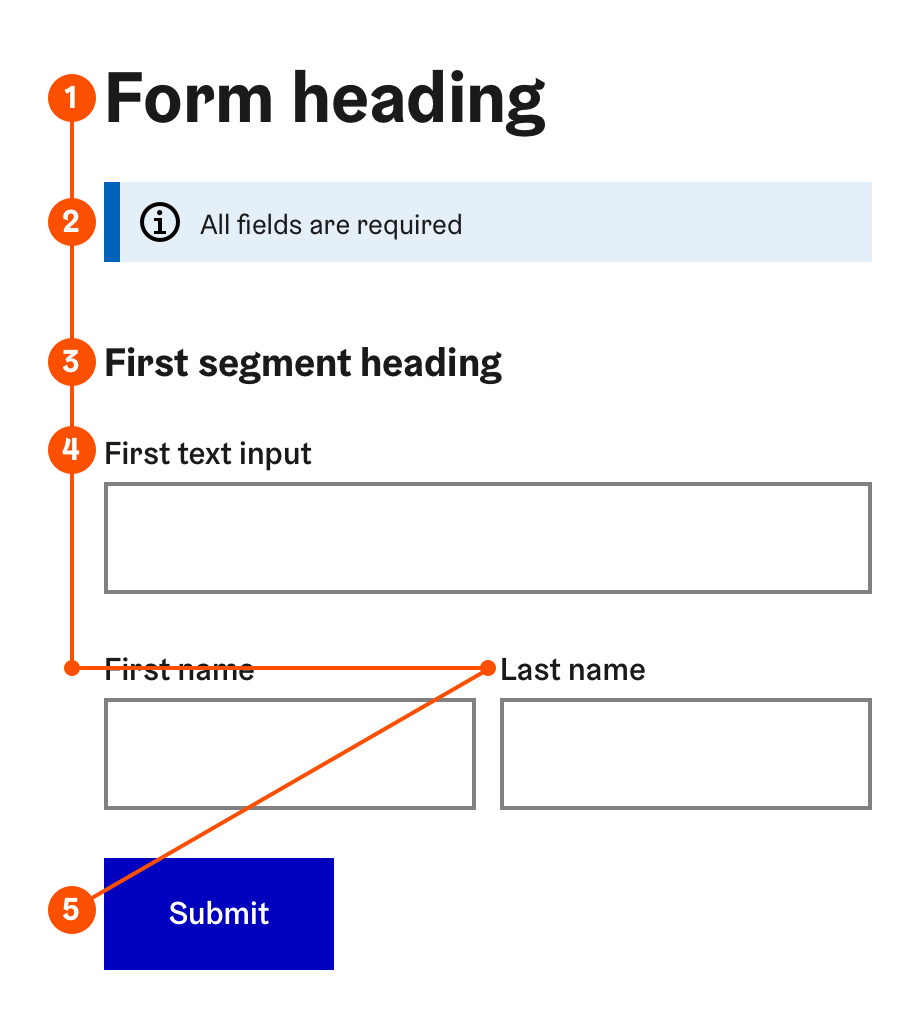
- Form main heading
- Form instructions
- First segment heading, fieldset or control
- Fields/fieldsets from left to right – top to bottom …
- Submit button
An example focus order for a multi page form:
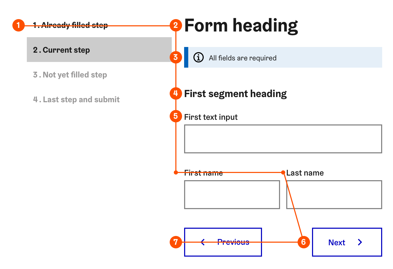
- Form navigation
- Form heading
- Form instructions
- First segment heading, fieldset or control
- Fields/fieldsets from left to right – top to bottom …
- Next page or Submit button
- Previous page button
- Check the order in which individual controls in the form receive focus
By default the focus order follows the DOM order, so in most cases checking that the controls are in the right order in the DOM tree is sufficient.
- If the focus order needs to deviate from DOM order, it can be customised with tabindex attributes.
Pay special attention to focus order when dynamically changing page content, adding or removing form controls, or clearing values
As a rule of thumb, the change should be made downstream in the focus order, not upstream, so the user can find the change by navigating forward.
New content should be added after the current focus point.
When current focus point is removed, focus should return to the last heading or legend of the fieldset.
- Focus must not leave the form when the content is dynamically changed.
In multi page forms, when the user proceeds to the next or previous page, focus should be directed to the heading of the form or current form step, instead of the beginning of the entire page. This helps the user to keep focus on the task at hand.
tabindex="-1" can defined for the heading, fieldset legend or other element where the focus should be directed after a dynamic content change or page change.
Not necessary in forms embedded into content. In these cases focus can start from page heading and follow the DOM order.
- Any form controls or essential information must not be placed after the “Submit” button.
- Important “small print” about the form as a text content or an anchor link to page.
- A checkbox for approving terms and conditions
In multi step forms, any form controls or essential information should not be placed after a “Next page” button
Exception: since navigating forward to the next step of the form is the most common action the user makes when reaching the end of a page, “Previous page” and other supplementary actions like “Clear form” can be placed after it.
Gender-neutrality in forms
Asking for gender
When asking for the user's gender, Other and Do not want to answer options must be provided. If these options are ordered, use order Woman → Man → Other → Do not want to answer since it is statistically the most probable. Using the Selection group component with radio buttons is recommended for this purpose.

