Multi-page forms
Filling a long form can be a daunting task for the user. One way to make a long form seem less like a chore is by dividing the form into separate steps that are shown one page at a time.
Principles
The goal of dividing a form into multiple pages (or steps) is to show less information on one page. Potentially, this has multiple benefits:
- Form steps will be shorter and require less cognitive effort to fill.
- Individual steps will be less overwhelming - encouraging the user to fill out the whole form.
- Each step will contain fewer form elements. This makes it easier to design forms that work well on different screen sizes.
- Users make fewer errors and errors will be easier to correct.
It is also important to note that multi-page forms do not come without their downsides. The main downside is that they increase the interaction cost of filling out the form. This means the user is required to do more clicking and scrolling to fill the whole form. Therefore, it is always important to carefully consider when the multi-page approach is beneficial and when it is not. The following gives you some rules of thumb to decide whether the multi-page forms are needed in your project.
When should you use multi-page forms?
- When the form can be divided into distinct themes. For example, "Contact information" -> "Application" -> "Payment" -> "Review and send".
- When the form is very long.
- What is considered a high number of form elements depends on the context. Usually, the number can be considered high if the user is required to scroll the view to see all form elements on a desktop-sized screen.
- When your users tend to do a lot of errors when filling out the form.
When should you not use multi-page forms?
- When the number of form elements is low. Dividing a small number of inputs into multiple steps increases interaction the cost of completing the form.
- What is considered a low number of form elements depends on the context. Usually, the number is considered low if you can fit all fields on a single view without the need to scroll on a desktop-sized screen.
- When the user needs to compare or move information between multiple form steps.
- When the form steps have a lot of relations. For example, a choice in a later form step must not make an earlier step erroneous.
- When you do not know in which order the user wants to fill out the form. Multi-step forms are generally designed to be filled out in a specific order.
- Note! HDS multi-page forms support filling out the steps in random order. However, this takes away many benefits that multi-page forms are designed to achieve.
Elements of a multi-page form
HDS multi-page forms consist of three (3) elements:
- Form headings
- Form navigation
- Form area
1. Form headings
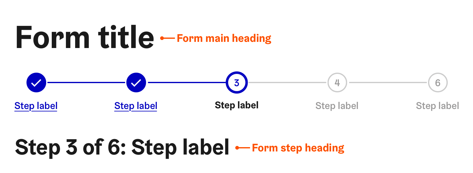
HDS multi-page forms feature two separate headings; the main heading and the step heading.
- The form main heading describes the whole form and it is located above the form navigation element.
- The form step heading describes the currently active step and it is located below the form navigation element.
The step heading must include the number of the current step and the total number of steps.
When the form page changes, move the browser focus to the step heading. If you use the step heading provided by the
HDS Stepper component
, this will be done automatically for you.
Customise heading levels if needed so that they are used semantically (h1 before h2 and so on).
2. Form navigation
HDS form navigation has two (2) main goals. First, it provides the user a visual indicator of the form progress. Second, it allows the user to navigate between (available) form steps.
The navigation is offered in Default and Small sizes. The small size omits the step text labels. However, the step circles will remain as interactable buttons.
Form step states
HDS provides pre-defined states for form steps. The following table lists all allowed states and describes situations where they should be used.
| Image | Name | Usage |
|---|---|---|
| Available | The step is available and the user can navigate to it. The step has not been filled yet. | |
| Selected | The step is currently active but has not been submitted yet. | |
| Filled | The step has been filled successfully. | |
| Disabled | The step is not available yet due to previous step not filled yet. | |
| Needs attention | The step demands user's attention. E.g. it has been changed by another user. | |
| Paused | The step progress has been paused. E.g. waiting for a review from officials. |
3. Form area
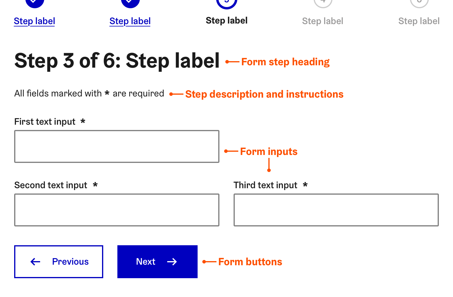
Below form headings and the form navigation is the form area. The form elements of the current step will be placed here. A step description and instructions can also be given below the step heading. Form buttons will be located at the very bottom of the form area. "Next" and "Previous" buttons should at least be offered but buttons can contain other actions too such as saving the form to continue later.
To learn more about how to construct form in the City of Helsinki services, please refer to HDS Form pattern documentation.
If your form description includes important instructions, you must include them on the every step of the form. Do not expect the user to remember instructions from earlier pages.
Handling errors
One of the main benefits of dividing the form into multiple steps is that the users will make fewer errors in general and the errors will be easier to correct. To read more about form validation please refer to HDS Form validation pattern documentation.
To make the error handling as easy as possible for the user, please follow these guidelines:
Use one of the form validation patterns listed in HDS Form validation documentation
- Do validation separately for each step/page.
- Always validate all inputs of the page when the user tries to leave the page.
- The main benefit of this is that the user only needs to worry about errors on the current page.
Do not let the user leave pages that have erroneous fields. Always validate input and guide the user to fix the errors before navigating to other steps.
Avoid situations where choices in steps could cause errors in other steps. Steps should be completely independent.
If this is necessary, make sure the user is well informed that attention is needed in earlier steps. Use HDS Inline Notification for this.
If it is possible that there are errors in previous steps when the user reaches the end of the form, offer a clear summary page of all errors are provide links to relevant pages to fix the errors.
End of the form
When the user reaches the end of the form, it is recommended to offer a review page as the last step of the form. This allows the user to review the information they are about to submit and potentially fix errors in the data. The review step is especially important for longer forms.


