Form validation
Forms are very common in the City of Helsinki services. Users making errors in forms is just as common. HDS Form validation pattern aims to clearly indicate erroneous inputs to users and make it as effortless as possible to fix them.
Principles
- HDS pattern is based on the following basic principles
- It must be easy for the user to locate the erroneous input field
- The error message is clearly visible and is easy to understand
- The error message stays on the screen as long as the error has been fixed
All following methods follow these principles even though their implementation may differ from each other.
HDS form validation pattern only concerns validation that happens in the frontend. You must never trust the frontend validation alone. Make the validation process in the backend too.
Types of validation
This page will provide basic principles for all as well as links to Storybook examples on how to use each validation method in practice. HDS pattern proposes three (3) form validation methods:
| Method | What does it mean? | When to use it? |
|---|---|---|
| Dynamic | Recommended option. Validation performed individually for each form control, when the user has entered a value and/or moves the focus to the next interactive element | Preferred method when client-side scripting (e.g. JavaScript) is available |
| Static | Validation performed for the whole form at once, when the user submits the form or proceeds to the next step | Use when client-side scripting is not possible |
| Hybrid | Dynamic and static methods utilised in parallel, benefitting from each other | Use when some of the validation has to be done when the form is submitted but client-side scripting is still possible |
There is a wide range of services in the City of Helsinki. Some projects are restricted to static validation due to technical limitations (e.g. no JavaScript). For these reasons HDS offers multiple validation methods and has examples available for all kinds of projects.
Dynamic validation
This is the recommended validation method in the City of Helsinki services.
In dynamic form validation the user input is validated immediately after the focus leaves the current form element and moves to the next one. If an error is found during the validation, the form control is set to an error state.
Dynamic form validation is recommended way to do input validation in the City of Helsinki services. The method allows the user to fix the error immediately rather than after the form has been submitted. This can greatly reduce cognitive load of the user since they neither do have to locate the erroneous input nor switch their context to the next input before fixing the error.
See interactive dynamic form validation example in HDS Storybook See dynamic form validation code example in HDS StorybookStatic validation
In static form validation the validation is done when the form is submitted or the next page is loaded. In this case the validation can be done either in the browser and/or in the service backend. This method is common for services which cannot use JavaScript for dynamic approach.
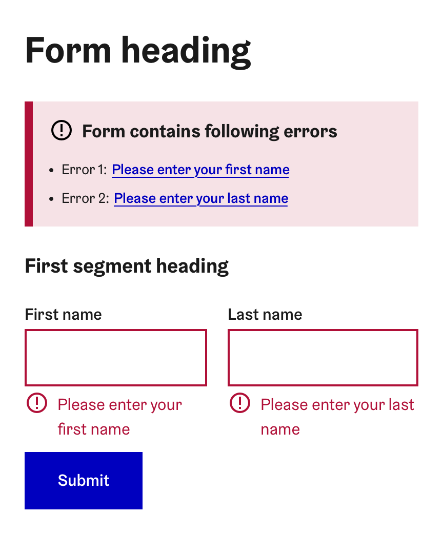
The general issue of static validation is that it is possible that there are multiple erroneous inputs after the validation. To make it easier for the user to go through the errors, HDS recommends using validation summary pattern in which all errors are gathered to one list on top of the form. The list contains all errors found the the form and an anchor link to each form control. You can read more about the validation summary pattern in its own section.
See interactive static form validation example in HDS Storybook See static form validation code example in HDS StorybookHybrid validation
Dynamic and static validation methods can be also used in parallel. This is particularly useful if part of the validation has to be done in the backend (e.g. checking if a user already exists). In this case, basic input validation can be done dynamically and other validations when the form is submitted. As in static validation, HDS recommends using validation summary pattern for errors that are found on form submit. You can read more about the validation summary pattern in its own section.
The advantage of hybrid validation is that because form controls are validated dynamically, the user generally receives less errors after the form submit. It is always recommended to use dynamic validation approach first but if some static validation is required, the hybrid validation approach can be used.
See interactive hybrid form validation example in HDS Storybook See hybrid form validation code example in HDS StorybookPresenting validation results
Form control error/success messages
When a form control has been gone through either dynamic or static validation, the state of the component should change indicating the inputted value has been validated.
Depending on the result of the validation, message is displayed below the form field if the value is valid or invalid.
1. Error message
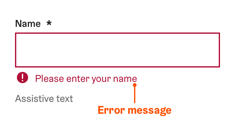
Error message indicates that a required field is left empty or the inputted value is in wrong format. The error message must be displayed if the value did not pass validation. The error message is visible until the error is fixed.
If the form control has an assistive text, it is displayed below the validation message. The assistive text should be never hidden when the error description is active. The user may need the information provided by the assistive text when correcting the error.
- Keep it short
Error text should not run longer than the form control and more than two rows.
- Be clear, specific and easy to understand
- An error text must clearly state
- precise descriptions of exact problems
- a specific solution or constructive advice on how to fix the problem.
- For example “Please select a language” or “Email address needs to have an @ sign”
- An error text must clearly state
- Be friendly
- Avoid negative expressions or blaming the user (for example “You did not enter your first name”)
Instead use positive words and a provide a correct solution (for example “Please enter your first name”)
Use vague statements (for example “There has been an error”).
Use technical terms or developer jargon (for example “Syntax error”). Use terms lay people can understand.
Output raw system errors (for example “Error 123-xyz”).
Fixing errors
When the input is in the error state, the user will eventually try to correct the error. The way how the input reacts to this depends on the validation method in use.
In dynamic and hybrid validation, checking if the error has been fixed should be done after each character change. For example, if the user has forgotten to input @ sign for an email input, the error disappears immediately when the @ sign is added.
In static validation, checking if the error has been fixed dynamically is not possible. The only way to check if the errors have been fixed is to submit the form again.
2. Success message
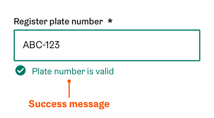
Success message indicates that an inputted value has passed form validation. Success messages are optional and they should only be used when the user must know if the input passed the validation. This is often the case for the following cases:
- The input format is very complex such as requiring a specific amount of characters or certain special characters (e.g. a social security number)
- When it is critical for the process that the user inputs the information correctly
- When the user is not easily able to determine if the input is valid or not (e.g. new password inputs, inputs validated dynamically from the backend)
It is better to avoid using success validation if there is not a clear need for it. Using redundant success messages creates unnecessary visual noise to the view.
3. Info message
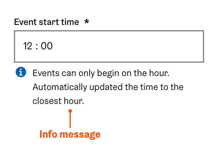
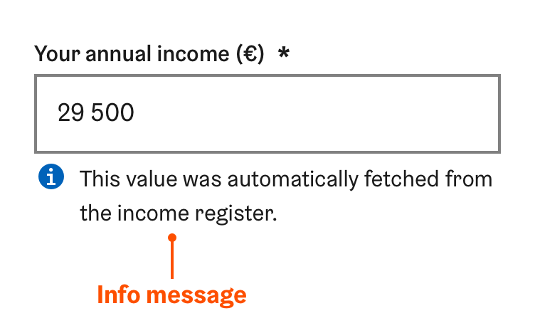
Info message can be used to convey information to the user which otherwise could be left unnoticed. The info message is optional and it should not be used to give instructions or display errors. It is meant to inform the user if something has caused changes to the input. Examples of situations requiring an info text could be:
- The value of the input has changed after the user edited it. For example, it was fixed automatically.
- Some other user or an official has made changes to the value.
- The value has been filled automatically for the user.
- The component status has changed. For example, a file was removed from the file input.
In the above example, the info text is used to inform the user that the time input value has changed after the user inputted it.
In the above example, the info text is used to inform the user that the input was filled automatically. It is also described to the user from where the information is coming from.
Validation summary pattern
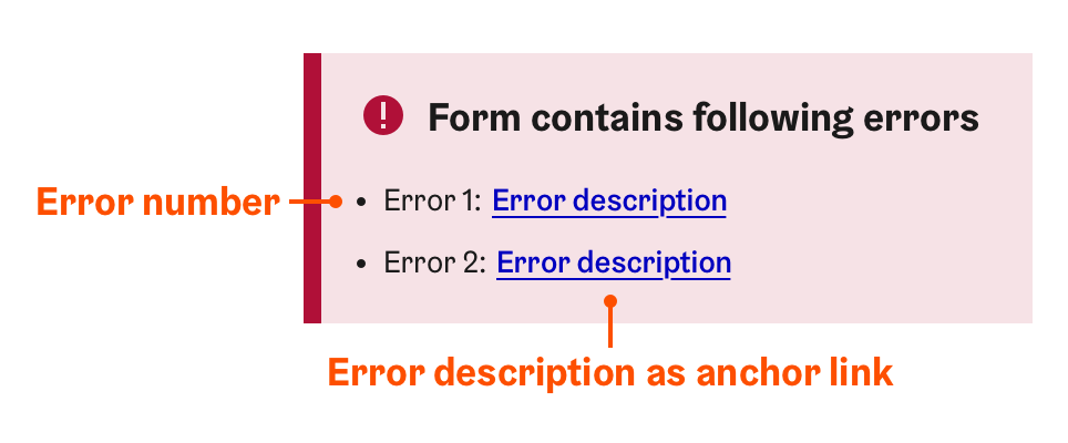
When using static or hybrid validation methods, HDS recommends using a validation summary to clearly list errors found during the form submit. Validation summary pattern uses an error summary component which is provided by HDS. The error summary is notification-like element which lists all errors (and their descriptions) found in the form and provides anchor links to each erroneous input for easy access.
You can learn more about the error summary component in HDS React Storybook..
The usage of the error summary component is triggered when the form is submitted:
- If errors are found in the form, the error summary component is created and placed at the beginning of the form, below the initial form heading.
- The focus is moved from the form submit button to the error summary heading.
- The error summary is populated with a list of errors found in the form. Errors are in the same order as they appear in the form. For each error, a running number and an error description are provided. The error description also acts as an anchor link.
- The user can use the error description anchor link to quickly jump and focus each of the erroneous inputs.
- When the user submits the form again and errors are still found, the contents of the error summary are updated and the focus is moved back to the summary heading again.
You can see the validation summary pattern in action in HDS Storybook static validation example and hybrid validation example.
Validation of multiple input fields
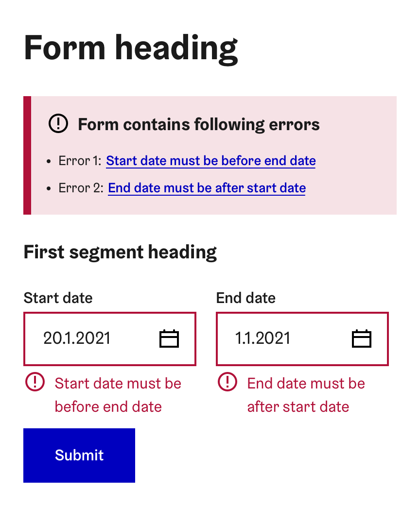
In some cases, multiple input fields can be related to each other in a way that a change in one of them may cause errors in the other inputs. In this situation, one specific error may relate to multiple inputs at the same time.
An example of this could be having two date inputs for setting a start and an end time. If the end time is set to be earlier than the start time, both date inputs become erroneous. Since assistive technologies only see one input at a time, all related inputs should be set to an error state and given an appropriate error message. The error message can be the same for all inputs or more input specific if the situation allows so. All error messages are also added to the error summary list. This method has been illustrated in the image below.
When there are multiple related fields, a later field in the form can make an earlier field erroneous. In this case, it is important to note that the state change of the earlier field can go unnoticed for assistive technologies. It is recommended to notify assistive technologies of other inputs' state change by using the HDS invisible notification.
Validation in multi-page forms
Coming soon
HDS Form pattern suggests dividing longer forms into separate steps. You can read more about this in the HDS Form pattern documentation.
Validation is strongly recommended to be done separately for each page of the form. This means that the user should not be able to proceed to the next form step before all the input fields have been validated on the current step. If some selection can make a selection in a previous step invalid, this should be clearly indicated to the user.
