Building navigation
DraftNavigation components are crucial as they help users navigate through an application or website seamlessly.
Principles
Adhering to these principles can create an effective and user-friendly navigation component that enhances the overall user experience.
- Keep it as simple as possible.
Consider the information architecture and site hierarchy. Determine what the most crucial information is and how many levels are necessary.
- Pay attention to label lengths and links.
- Keep them as concise as possible and ensure navigation links match their destination pages. If multiple links lead to the same page, use identical labels.
- Prioritise mobile users.
- Design your navigation system with a 'mobile-first' mindset and ensure seamless functionality on mobile devices and touchscreens.
- Don't utilize the content area for navigation purposes.
Avoid duplicating all navigation links in the content area; use content-relevant navigation links on specific pages.
Exception: On landing pages, consider adding links in the content area for improved mobile user experience, as many users avoid opening menus.
- Don't sacrifice clarity for style.
While it's essential to maintain a visually appealing design, prioritize clarity and usability when implementing the navigation pattern.
Recommended order of navigation components
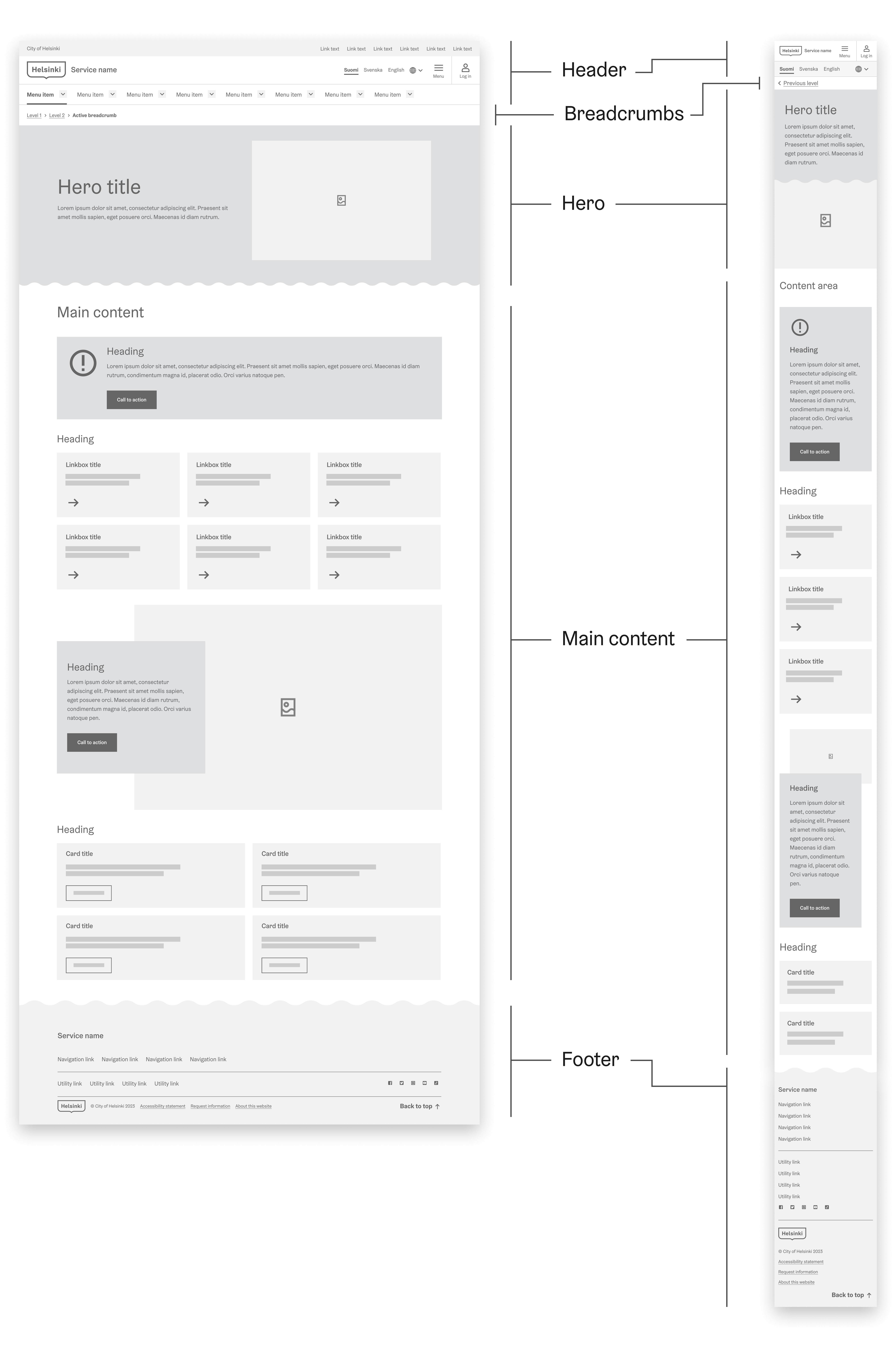
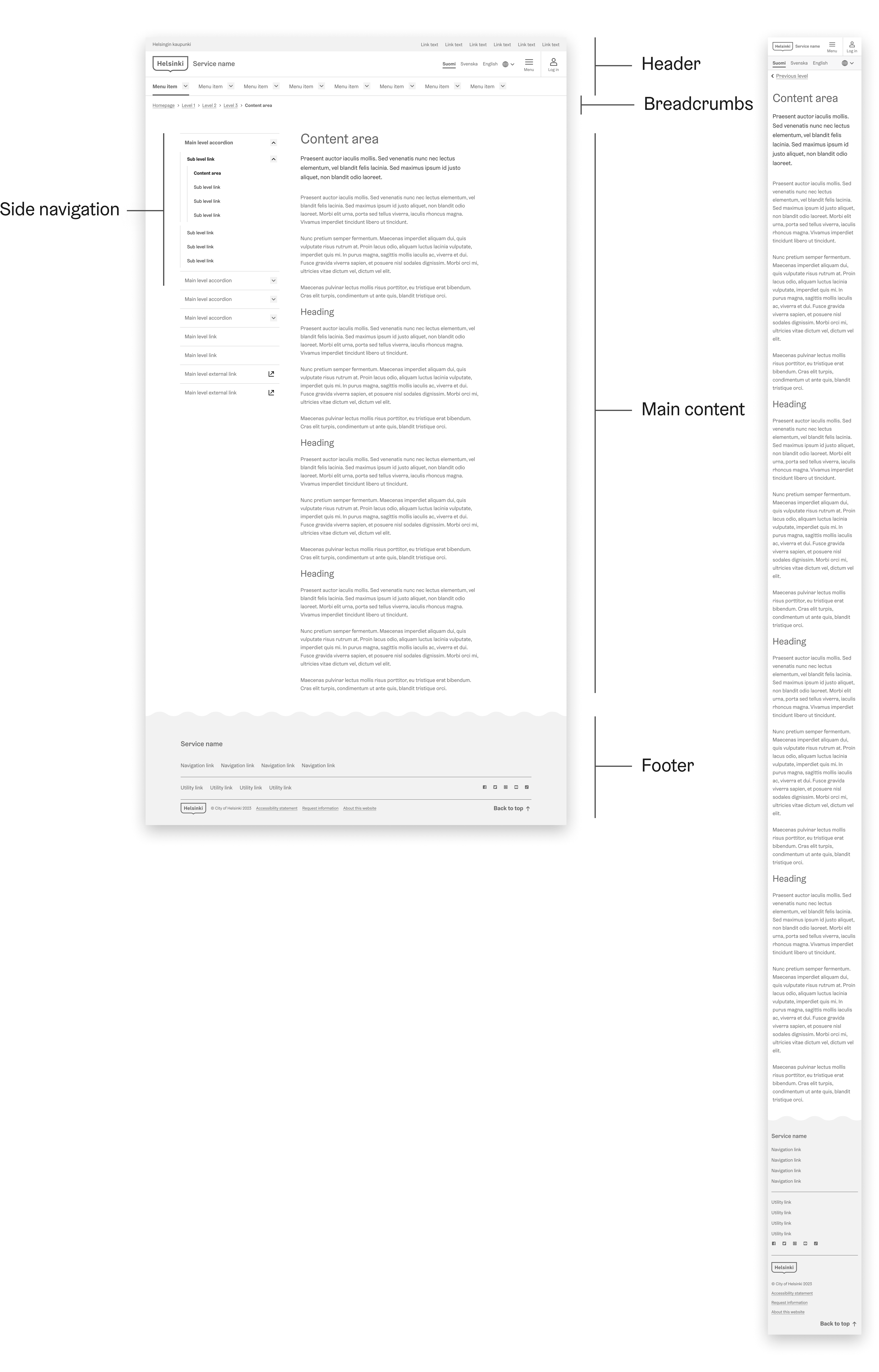
When implementing a navigation pattern, it's essential to consider the order of navigation components to ensure a logical, intuitive, and user-friendly experience.
On a landing page
On a regular page with side navigation
1. Header (required)
The navigation components are placed at the very top of the page and serves as the primary navigation area for your website or application. The Header component is a wrapper for the HDS header navigation components. This means you should put all the other header sub components inside this component.
The header's consistent placement and appearance across all pages make it easily recognizable and accessible to users, allowing them to navigate the site quickly and efficiently.
The inner components of the Header should always be in this order:
- HeaderUniversalBar
- HeaderActionBar
- HeaderNavigationMenu
To learn more about the Header component, please refer to the component page.
2. Breadcrumbs (recommended)
Breadcrumbs are a secondary navigation component that helps users understand their current location within the site hierarchy and offers a simple way to navigate back to previous pages. Placed immediately below the header, breadcrumbs provide context and enhance usability by offering a clear path through the website or application.
To learn more about the Breadcrumb component, please refer to the component page.
3. Hero (optional)
Hero is an optional but highly recommended component on landing pages. Use it only on landing pages, not on all pages. Hero's placement is below the breadcrumbs or the header.
Hero serves as a visual and content-focused introduction to the page, typically including a large image, heading, and a call-to-action button or message. Hero helps grab the user's attention and sets the tone for the rest of the page.
Hero title
This is an introduction text. The length is circa two sentences. The suitable total length of the title and introduction is around 230 characters, including spaces.
To learn more about the Hero component, please refer to the component page.
4. Side navigation (optional)
Side navigation can complement the primary navigation components at the top of a page, offering users an additional way to navigate your application or website.
- Don't use side navigation on landing pages with the hero component. This approach maintains a coherent and straightforward navigation experience for users arriving on these pages.
- For page-specific navigation that is simple and one-layered, consider using the Tabs component as an alternative to side navigation. Tabs can be a more intuitive choice in such cases.
Navigation Hierarchy in Main and Side Navigation
Effective navigation levels hierarchy is essential for user-friendly interfaces. To ensure clarity and usability in your navigation design, consider the following guidelines:
Main Navigation Levels: 1 - 3
- Use the main navigation for the 1st to 3rd levels of your navigation hierarchy. These top-level categories provide users with a clear overview of your application's or website's structure.
Side Navigation Levels: 2 - 5
- Side navigation is most effective when utilized for the 2nd to 5th levels of your navigation hierarchy. This tier allows for more detailed access to sub-sections and features, enhancing the user's ability to explore content within specific categories.
Overlapping Levels:
- Avoid more than one (1) overlapping level between the main and side navigation. Overlapping items can increase cognitive load on users as they need to process redundant information from multiple menus.
Caution: Avoid exceeding a total of 5 navigation levels when combining main and side navigation. An overly complex hierarchy can confuse users and hinder their ability to find information effectively.
To learn more about the SideNavigation component, please refer to the component page.
5. Main content (required)
Following the hero section, the main content area is where the primary information and functionality of the page are presented. This section should be well-structured, with headings, subheadings, links and other design elements, such as linkboxes, images, cards, that guide users through the content.
Help the user to focus on a single topic, providing only relevant links in the content area.
To learn more about the heading hierarchy, please refer to the Typography page.
To learn more about the Card component, please refer to the component page.
To learn more about the Link component, please refer to the component page.
To learn more about the Linkbox component, please refer to the component page.
6. Footer (required)
The footer is placed at the bottom of the site and includes supplementary information and links, such as contact details, legal information, social media icons, and secondary navigation elements. The footer helps users find additional resources and reinforces the overall site structure by providing a consistent and accessible navigation area on every page.
To learn more about the Footer component, please refer to the component page.
Focus order & keyboard navigation
Building a correct focus order is essential to ensure accessibility and provide a good user experience for all users, including those using keyboard navigation or assistive technologies. It's crucial to test your focus order using a keyboard alone to ensure it works as expected.
Focus order, or tab order, refers to the sequence in which interactive elements on a webpage or application receive focus when a user navigates using a keyboard. Here's a general guideline on how to build the focus order for keyboard navigation:
Logical order
Focus order should follow a logical and intuitive pattern, usually from left to right and top to bottom, mirroring the reading order in the majority of languages. This allows users to predict where the focus will go next, enhancing usability.
Example of the order with HDS navigation elements
- Header
- Breadcrumbs
- Hero
- Side navigation (including essential links if used concurrently)
- Main content
- Footer
Use of ARIA roles
Use ARIA roles to clearly denote different sections of your page. This helps assistive technologies understand your content and improve the focus order.
Element priority
Interactive elements such as links, buttons, and form fields should be given priority in the focus order. Non-interactive elements, like headers or paragraphs, usually don't need to be included unless they provide some functionality upon focus.
Skip links and "Back to top" links
Implement "Skip to main content" or "Skip navigation" links at the beginning of the page to allow keyboard users to bypass lengthy navigation menus and reach the main content more quickly.
"Back to top" links, accessible via keyboard navigation, simplify returning to the start of a page, especially valuable on lengthy pages.
Modal and popup focus
When a modal or popup appears, the focus should shift to this new content and trap focus within it until it's closed. Once closed, focus should return to the element that triggered the modal.


