Examples
DraftExplore our collection of navigation patterns from the City of Helsinki's digital services. These examples demonstrate the effective implementation of user-centric design principles, resulting in accessible and efficient navigation experiences.
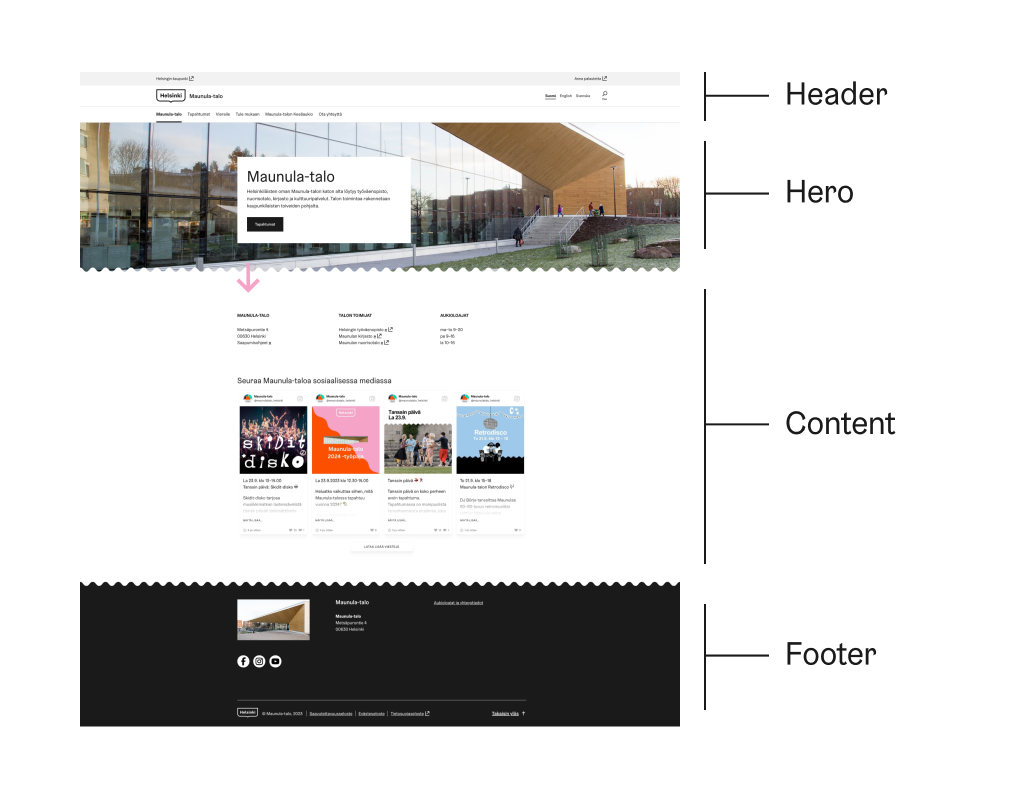
Simplicity in Action: The Maunula House website
The Helsinki residents’ very ownMaunula House's website, serves as an excellent illustration of minimal navigation pattern elements usage. It has all the required components Header, Content and Footer. It provides simple and low hierarchy navigation pattern.
Always try to minimize navigation elements to clarify service structure and avoid burdening users with irrelevant options. HDS recommends using the minimum navigation pattern whenever feasible, as it enhances user experience and aids in effective content exploration.
- Header (1 level)
- Hero (on landing page)
- Main content
- Footer
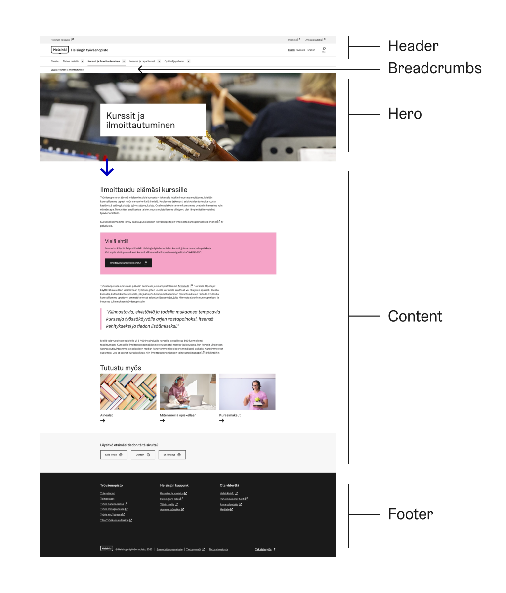
Navigational Balance: The Helsinki Finnish Adult Education Centre Website
The Helsinki Finnish Adult Education Centre website, which has a balance with its navigation pattern elements. This well-structured website includes all the necessary components and integrates 1–3 navigation levels. Notably, it features navigation links within the content area, enhancing the user experience, particularly for mobile users.
This thoughtful approach optimizes navigation without overwhelming users. By incorporating a medium navigation pattern with navigational links in the content area, the website ensures accessibility and ease of use.
- Header (1–3 levels)
- Breadcrumbs
- Main content
- Footer
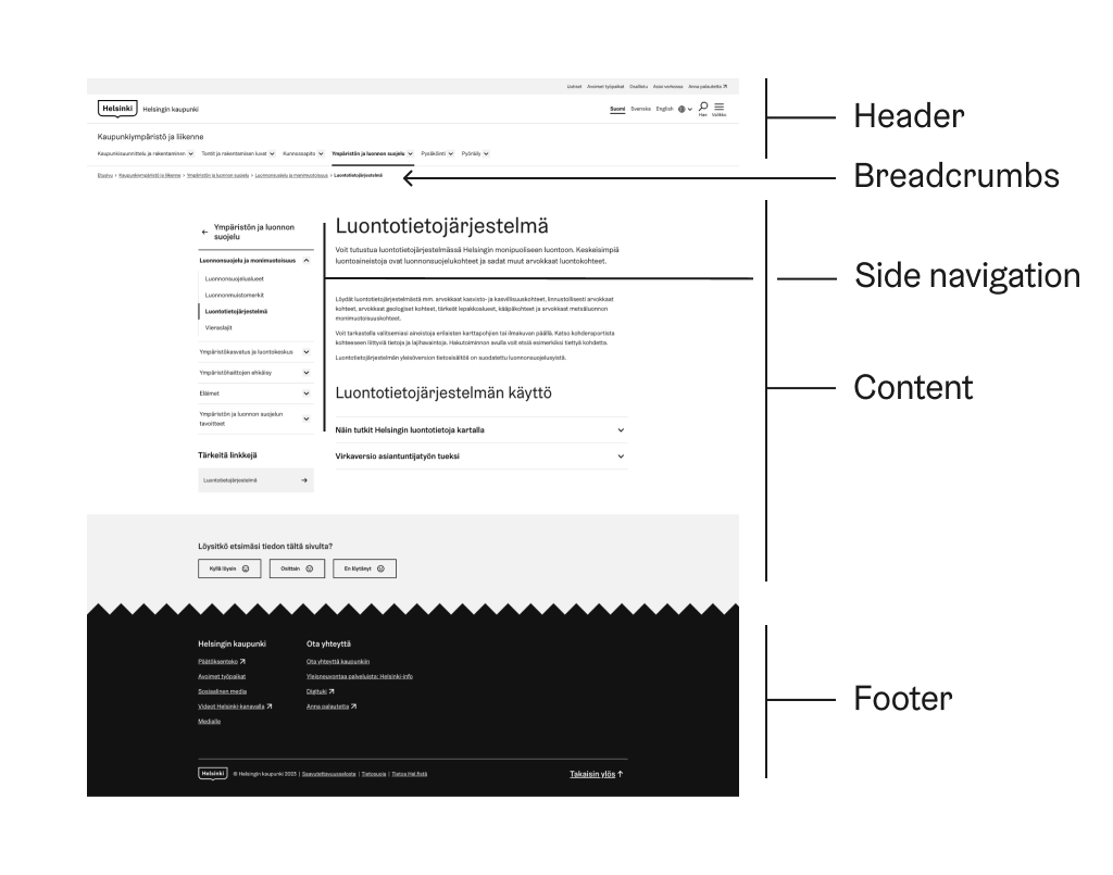
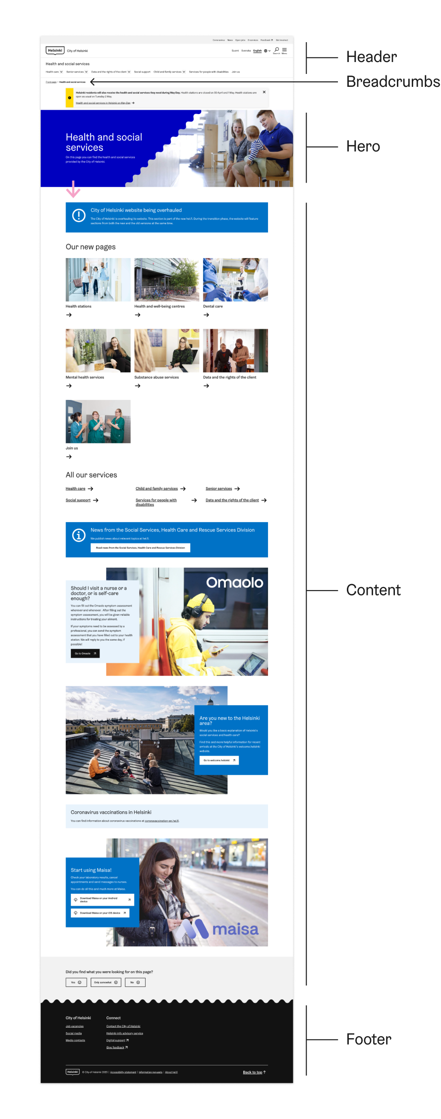
Exploring multi-level navigation: Hel.fi website
Thehel.fi website, the official web portal for the City of Helsinki, employs a well-working navigation pattern to guide users through its comprehensive array of services and information. This effective navigation pattern is characterized by the following key elements:
Consistent header: The website features a consistent header across all pages, containing the City of Helsinki logo, a search bar, and the main navigation menu. This helps users quickly access important sections and maintain orientation throughout their browsing experience.
Clear main menu: The main menu is organized into logical categories, with concise and unambiguous labels that accurately represent the content within each section. This intuitive categorization simplifies navigation and helps users find the information they seek with ease.
Responsive design: The hel.fi website is designed to be responsive, adapting to various screen sizes and devices. This ensures a seamless experience for users, regardless of the device they are using, making the navigation pattern accessible to a wide audience.
Breadcrumbs: The website incorporates breadcrumbs, offering users a clear path through the site hierarchy and making it easy to navigate back to previous pages. Breadcrumbs provide valuable context and enhance usability by displaying the user's current location within the site.
Accessible features: The hel.fi website is designed with accessibility in mind, catering to users with different abilities by providing features such as keyboard navigation, compatibility with screen readers, and adherence to WCAG guidelines.
Localized content: The website offers content in multiple languages, making it accessible to a diverse user base and allowing users to easily switch between languages as needed.
Footer with supplementary links: The website's footer contains additional links to essential resources, contact information, and social media channels, providing users with a consistent and accessible navigation area on every page.
Hel.fi sub-page
The hel.fi website is one of the largest public services for City of Helsinki and stands as a good example of complex multi-level navigation pattern. Here's how the sub-page navigation pattern works:
- Header: The website features
Header.ActionBarwith a hamburger mega-menu along the horizontalHeader.NavigationMenu. This provides robust support for the first navigation level in large-scalee website but it is not recommended for small ones. - Navigation menu: The horizontal
Header.NavigationMenufeatures levels 1–3 in hel.fi sub page. It has concise and unambiguous labels, ensuring that users can easily access key sections of the website. - Side navigation: The side navigation is supporting lower navigation levels 1–4. Side navigation usage ensures seamless navigation hierarchy in multi-level websites.
- Header (1-2 levels)
- Breadcrumbs
- Side navigation (1–4 levels)
- Main content
- Footer